Summary
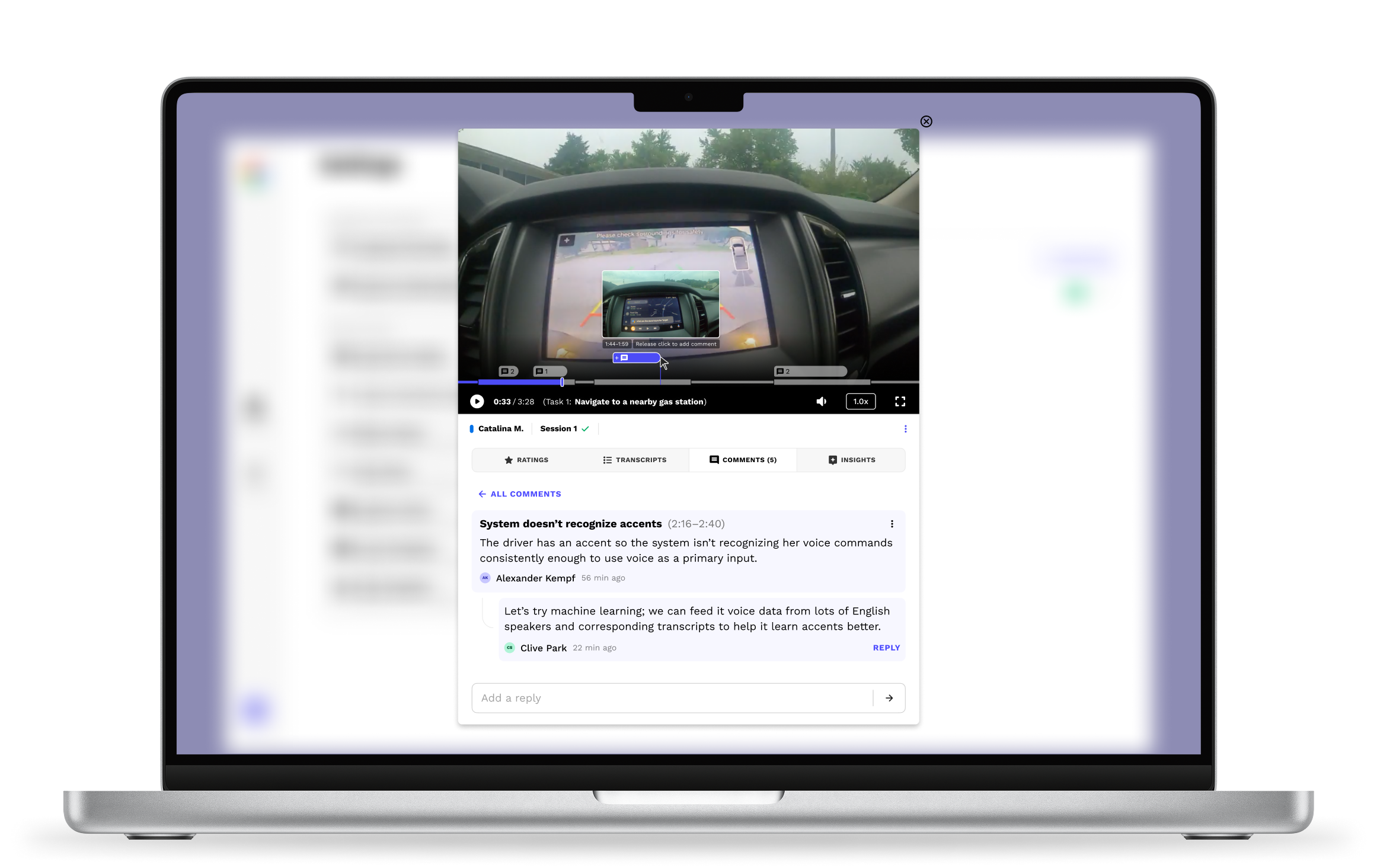
Our research platform gave clients no way to deeply analyze study video, so teams found fewer insights and relied on third-party tools to collaborate. I designed a 0-to-1 video player with Google's Android Auto team that lets research teams watch video, then mark and discuss key moments without leaving the app. Other Google teams and clients adopted it for their own research studies.
Impact
NOTES
ROLE
Owned design of this project, including:
UX research + UI design + UX design + Interactive prototyping + Developer handoff
COLLABORATORS
Android Auto (client): Product feedback
Head of Design: Product vision
Developers: Code + Deployment
INDUSTRY
Technology + UX research
TIMEFRAME
Q4 2024 (1 month)
Context
Researchers record and review study video to find product insights.
Pulse Labs makes a research platform that helps researchers learn from people using products in real life. Studies often include hours of video of people doing real tasks, such as drivers in their cars.
Each study has three stages: Planning, Data Capture, and Analysis. This project is part of Analysis, where researchers review the video to draw out product insights. Insights and the rest of a study’s results live in the researcher dashboard, which I also worked on.
Problems
But teams had no way to mark and analyze key moments in that video.
For a testing and insights platform, our video player was surprisingly lacking in analysis features. It had three core issues:
-
▪
Limited features.
It only played video, with nothing for deeper analysis or teamwork.
-
▪
Other tools needed.
Users left the app for analysis and collaboration, wasting time and losing clarity and context between tools.
-
▪
No task context.
Users couldn't see where each task started or ended, adding to confusion and wasted analysis time.
Takeaway: Clients needed an all-in-one tool to review, mark up, and discuss study video and audio.
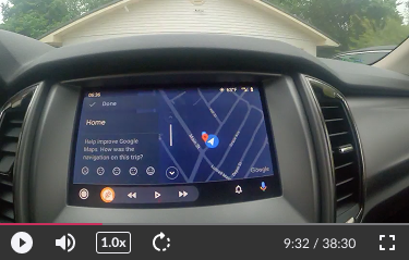
The original video player
Approach
I interviewed the Android Auto team to understand their video player needs.
In addition to playback, they asked for three main features: see where each task starts and ends, mark interesting parts with highlights, and leave comments. I decided all of it belonged inside the player itself for clarity and ease of use. Three ideas shaped the design:
▪
Keep context in view.
Show tasks, highlights, and comments on the progress bar, not in separate lists.
▪
Make task boundaries obvious.
Show researchers exactly where one task ends and the next begins.
▪
Analyze the requests.
Treat Google's three requests as needs to solve, and check whether each one requires its own feature.
Process
Prototyping their requests revealed what researchers actually needed.
Initial concepts
My first prototype was cluttered when collapsed and stacked too high when expanded, and color didn't save it.
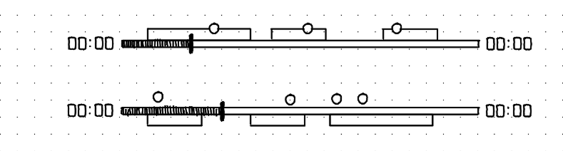

Collapsed: Overlapping elements are ambiguous and overwhelming
Expanded: Stacks too high and lacks hierarchy
Rethinking the design
I returned to sketches to create something more minimal without sacrificing functionality. By default, the player shrinks to a compact bar. On hover, tasks become segments of the progress bar with names beside the playback time.

By default (no mouse hovering), the player shows a clean, compact view instead of every detail at once

On hover, tasks appear as simple segments on the progress bar, with task names near the playback time. This significantly reduced clutter.
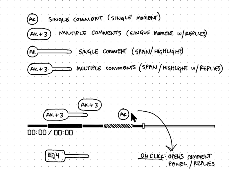
A highlight without a comment is meaningless, so I combined Google's requested comment and highlight features into one. A comment can mark one moment or span a stretch of time, replacing highlights. This simplified the screen and encouraged more discussion. Sometimes what a client asks for isn't what they need.
Solution
One tool to watch video, mark and discuss key moments, and find insights.
The progress bar stays compact by default for viewing clarity, with comments above it flagging interesting moments. On hover, it expands to show tasks and comment details.

Default mouse-leave and hover states
Note: The gaps between tasks show time a participant spent in the Pulse Labs app, away from the tasks. This varies a lot by study, so the gaps are shown for demonstration and developer purposes.
Click to comment on one moment, or drag to comment on a span of time.
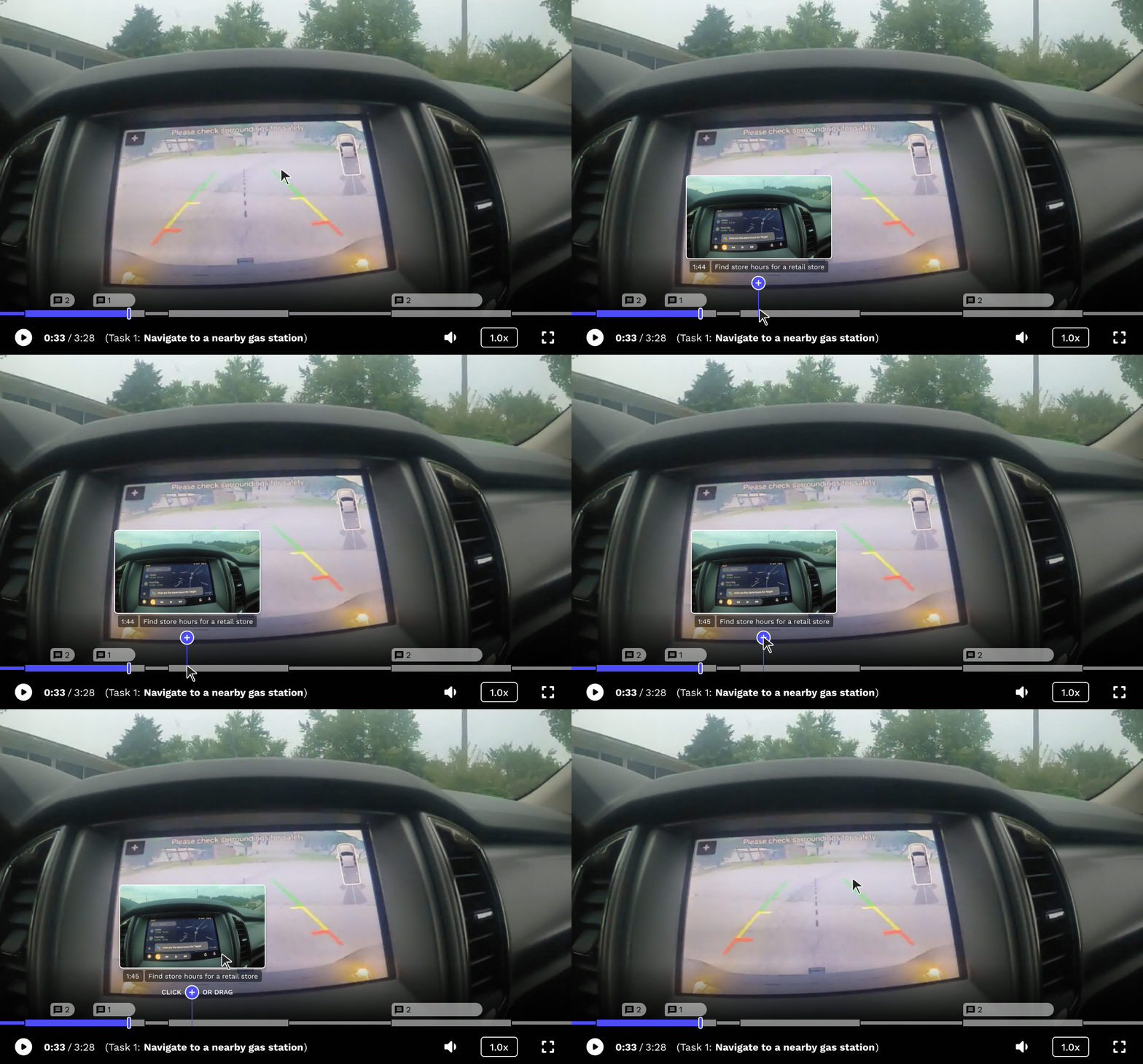
Hovering over the “add” icon shows users they can click or drag to add a comment
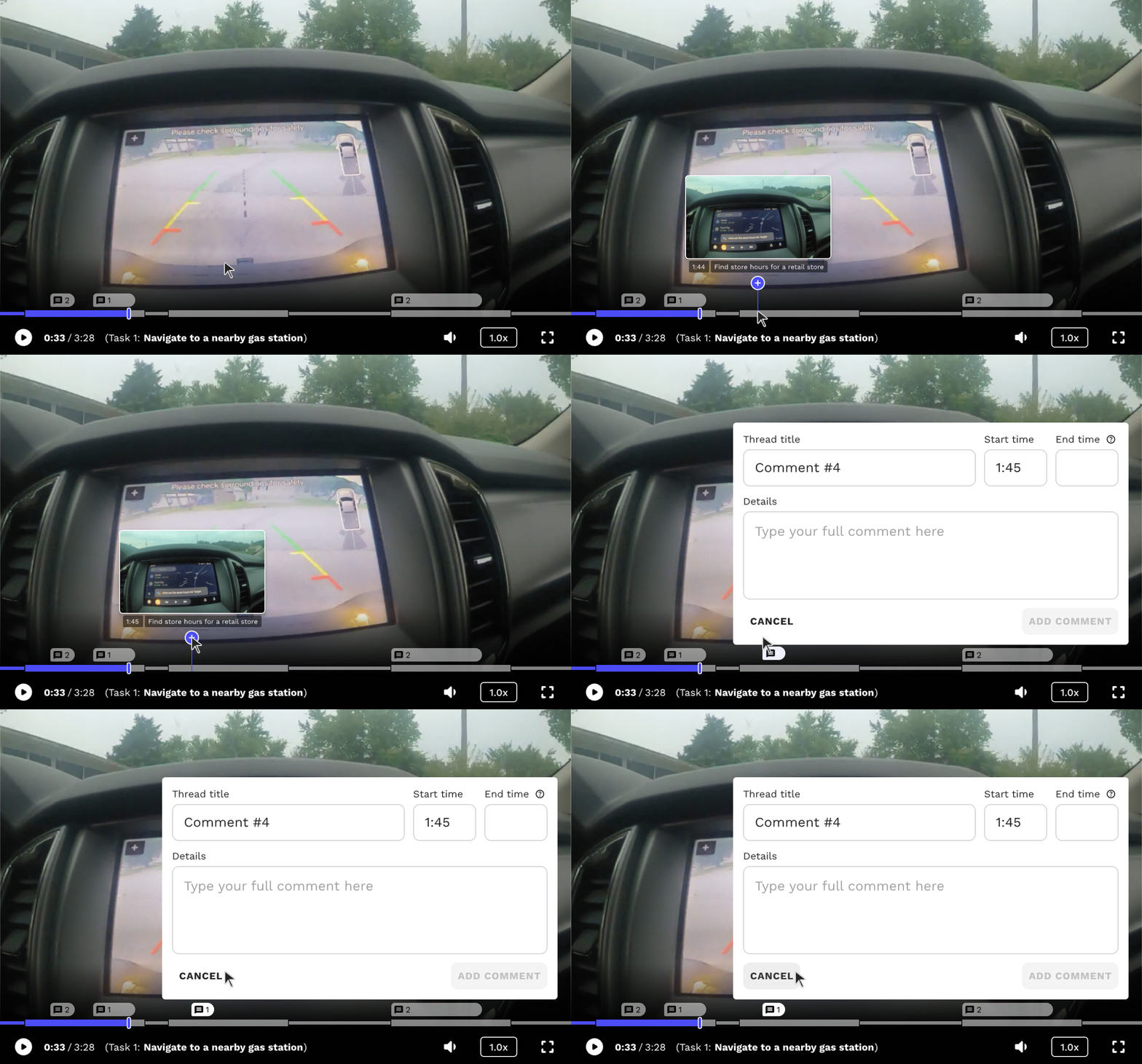
Adding a comment on a single moment in time
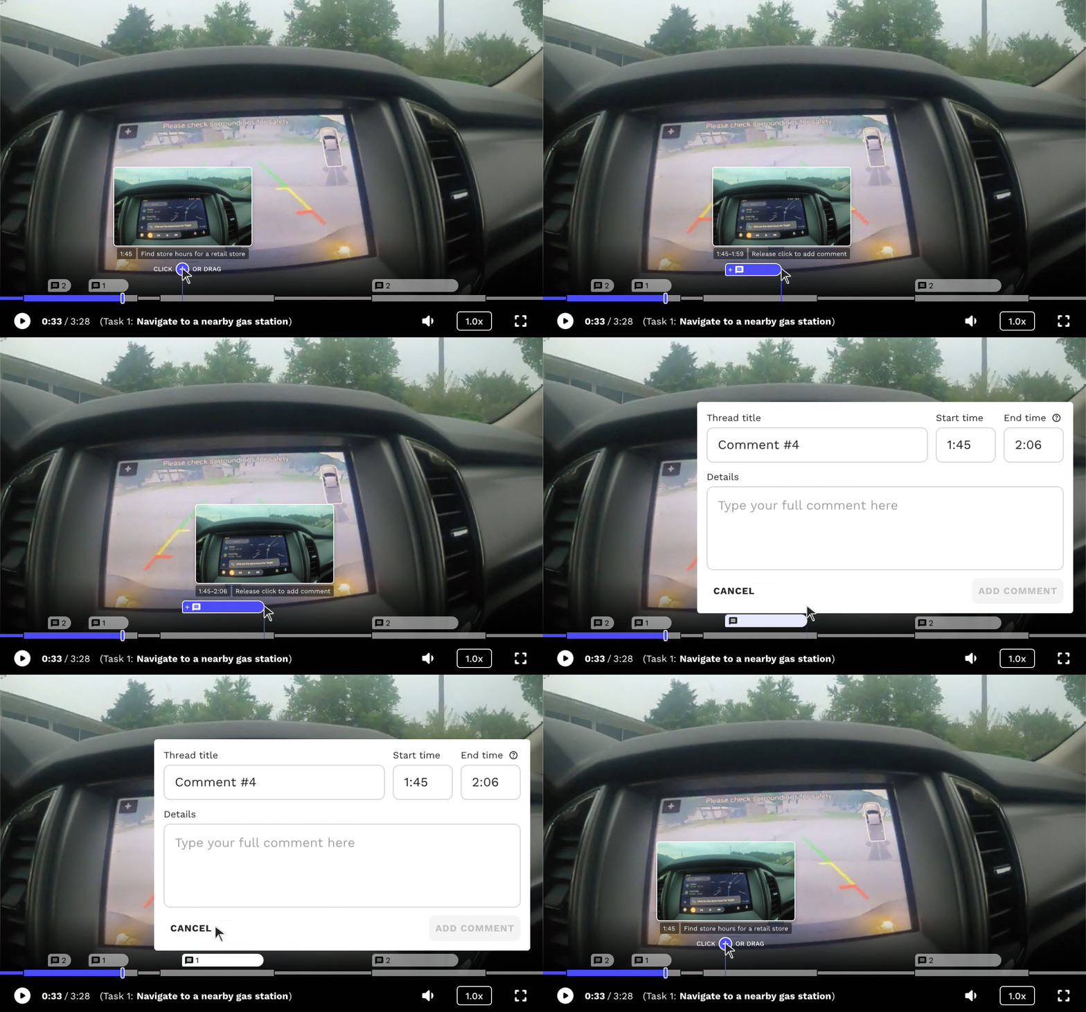
Adding a comment that spans a range of time
Comments preview on hover and open in a Comments tab for review, editing, and replies.

Hovering over a comment displays a preview
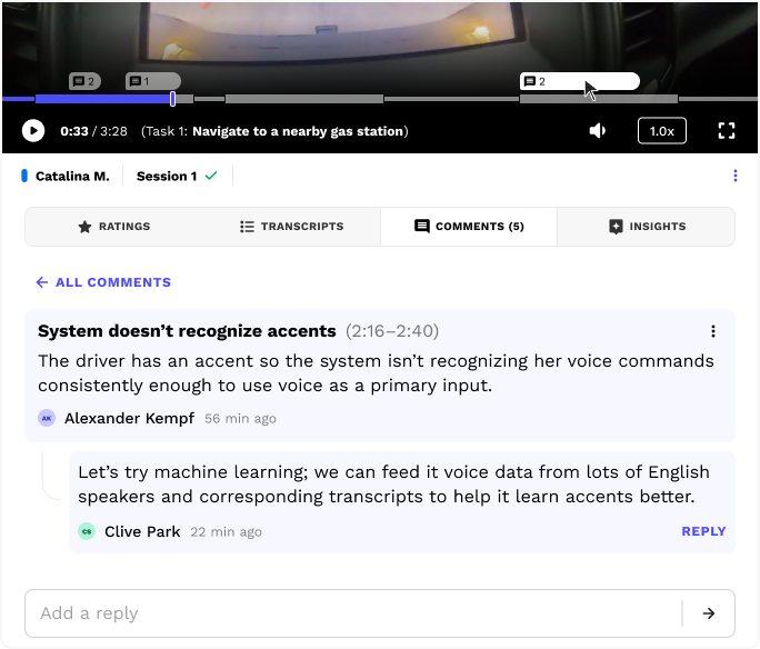
The Comments tab automatically opens when a user clicks on a comment in the progress bar
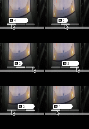
Overlapping comments stack as tabs, so the player never grows taller. Tasks can also overlap, but only when a researcher manually edits task start and end times during analysis, which is rare.
Impact
Research teams at Google and Amazon used it to find better insights faster.
Client feedback, plus product figures from company announcements:
+
▪
More and better insights.
Clients derived a higher number of deeper, nuanced study insights about their products and users.
+
▪
Dozens of hours saved.
Teams analyze, discuss, and review video in one place instead of juggling multiple tools, saving dozens of hours per study.
+
▪
Used on Android Auto, Gemini, and Alexa.
Teams on products with 250M+ cars, 1B+ monthly users, and 600M+ devices used this tool to turn study video into product insights.
Next steps...
Here's what I'd do differently in hindsight:
Hidden gaps: Let users visually hide the gaps between tasks for a cleaner, more focused task view.
Helper icons: Add animated helper icons that teach people how to add spanning comments.
Deeper client feedback: Run usability tests, interviews, or surveys with clients to continually improve it.
Thank you for viewing my work.
Schedule a call to go deeper on my workflow and design decisions.