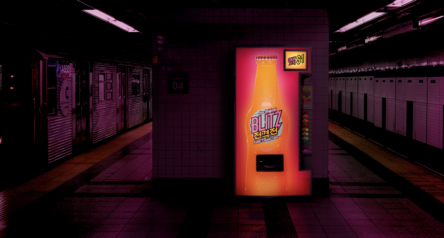
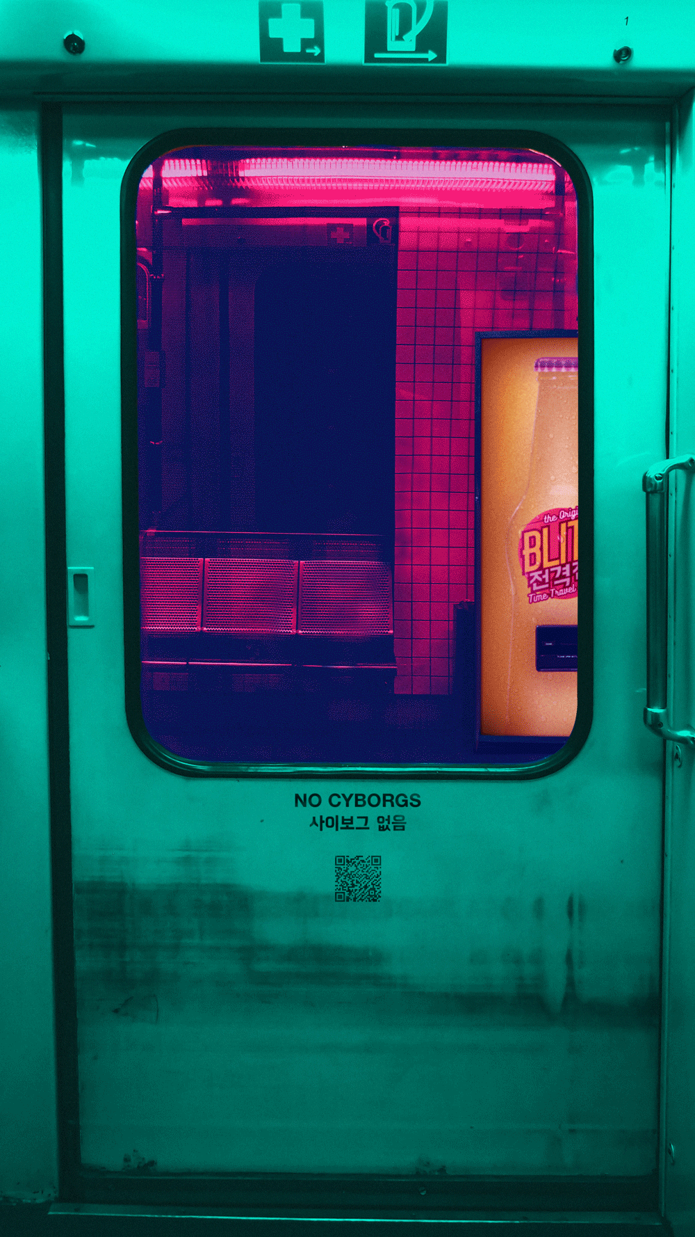
Blitz - The Original Time Travel Cola
Futuristic Branding Concept • 1 min read
Optimized for desktop, Last updated: 27 Nov 2021

BLITZ is a fictitious cola brand offering a glimpse into a futuristic cyberpunk world.
The brand combines a bright color profile with undertones of nostalgic retro typography for something that’s simultaneously fresh and classic.


Each new glance at the rear label reveals unexpected comical gems meant to both entertain and inform potential drinkers of what they’re about to partake in.

BLITZ comes in various flavors with corresponding colors, often acting as one of the few light sources in otherwise dark and derelict streets.


City dwellers flock to BLITZ machines like moths to a flickering flame, eager for a cheap thrill or ice cold, radioactive refreshment.
The challenge here was combining conflicting visual styles into something that’s cohesive—something that’s both familiar and next-gen.
A sharp-edged sans serif font paired with a distinct slant suggests movement and energy, while a softer retro font hearkens back to a simpler, more forgiving era.
The Korean characters translate to “blitzkrieg” and add an international flair to the label.

My goal with BLITZ was to develop a brand that could seamlessly fit into a dark sci-fi universe.
I borrowed from Treyarch’s Perk-a-Cola and Bethesda’s Nuka Cola product branding for BLITZ’s initial concept, loving the idea that an unassuming retro facade can mask a volatile product underneath.
I took cues from soda commercials, wanting the bottles to look as crisp, cold, and thirst-quenching as possible with bright colors and generous amounts of external condensation.
