

I built Anduril's spatial tagging goggles with no game engine, no coding, and no VR experience.
Building Anduril's EagleEye on the Quest 3 in 24 Hours
Passion Project
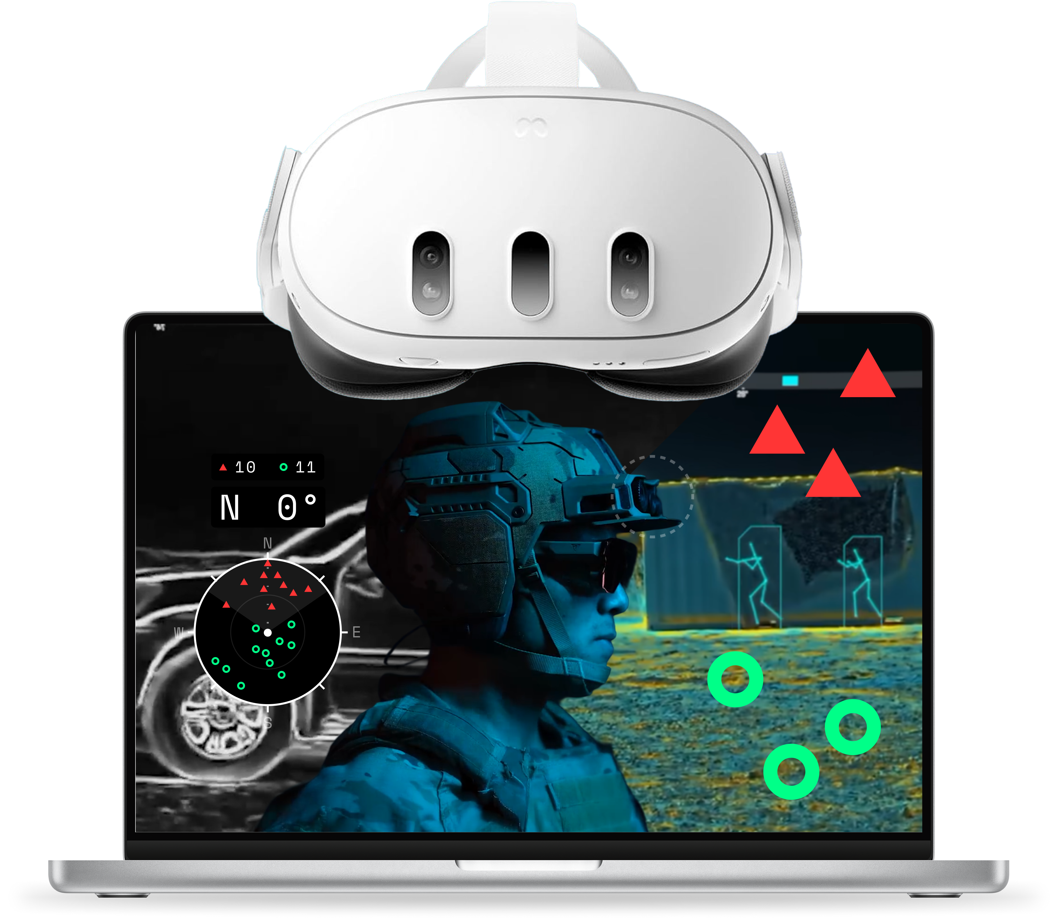
TL;DR
I designed, built, and tested a small, hobby version of Anduril's EagleEye goggles in about 24 hours, using the Quest 3's see-through camera, the Unity game engine, and Claude Code.
Highlight
I literally have no coding experience. I've never touched a game engine before either. So, despite being outside my comfort zone, this project was a blast. I manually-designed the Figma HUD and prompted Claude to generate the code, helping me piece everything together in Unity. As of this writing, Figma Make was a disappointment for generating HUD designs but Claude was the MVP here, turning my vision into a reality that just worked every single time.
Notes
To be clear, this project is a rough, quick experiment with vibe-coding and game engines for my own personal design growth; there's no implied value for actual defense applications. It's just a fun excuse to learn something new. Also, while I spent about 24 hours working on this, the work occurred over several distinct days.
Role
UI design
Interactive prototyping
Collaborators
Claude AI
Timeline
Q3 2026

Process
AI Setup (Hour 0-0.5)
I asked Claude to act as my lead designer and engineer, since I had no coding or game design background, and to help me build something inspired by Anduril's EagleEye within three days.
"Help me design, code, and test a simple but impressive VR/AR goggle app on my Meta Quest 3. I have no coding experience or game design experience so you will take on the role of lead game designer and software engineer and instruct me what to do in detail. The project will involve some sort of UI from Figma. I need your help coming up with an app idea on the Quest 3 goggles that would interest hiring managers for a job description at Anduril. I have thought about trying to make some sort of object tracking system to mimic their Eagle Eye product. I prefer to build the project in Unreal Engine but Unity is okay too; if there is another tool that's better please advise me. I would like the project to be done in 3 days or less if possible.“
We settled on a general idea: an AR spatial tagger where you place friendly and hostile markers in your real room. But it needed more than just that.
Gathering Requirements (Hour 0.5-2)
I studied EagleEye's public demo again to gather its capabilities and reconcile them with Claude's general idea.

Screenshot of Anduril's public EagleEye demo: AR markers

Screenshot of Anduril's public EagleEye demo: See-through objects (not within the scope of this project or the capabilities of the Quest 3)
A real-time see-through-walls feature was impossible to build, and true object detection would take too long, so I scoped it down to:
Placing markers in world space (representing hostiles and friendlies)
Markers that persist through walls with lower opacity
On hover, display marker details like distance and time
Tally system for hostile and friendly markers
Minimap that shows markers around the user in 360°
Compass with cardinal and azimuth heading
Top horizontal compass and marker map
I researched best practices and limitations for VR app/game design to give myself a solid starting point for HUD design, including field of view, screen dimensions, resolution, room boundaries, hand tracking, and other topics I was completely oblivious about. Claude was able to give me a lot of this information but I did some of my own digging too, which proved beneficial.
The main technical and design takeaways were:
110° horizontal and 96° vertical for VR screens (1.15 ratio)
2064 x 2208 dimensions (I settled on 1700 x 1500 for the actual HUD size)
Using Meta's default VR SDK in Unity was the easiest and fastest way to get started
I condensed all my planned features, design specifications, and goals into a single prompt for Figma Make to help me with the UI.
Designing in Figma (Hour 2-4)
I want to say that Figma Make took my prompt and designed exactly what I needed on the first try. Or the second try. Or the third. Figma Make just didn't deliver on my vision; the designs were too complicated. It's possible my prompting could improve, but I wasn't happy with the results:
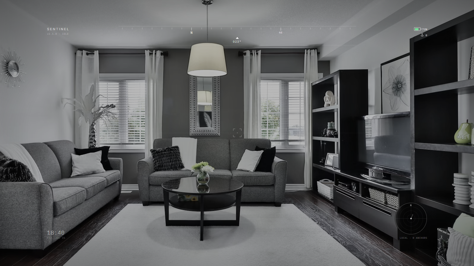
The first Figma Make iteration. The HUD is way too light and small.

The second Figma Make iteration. Better but legibility is horrible and it's too detailed.
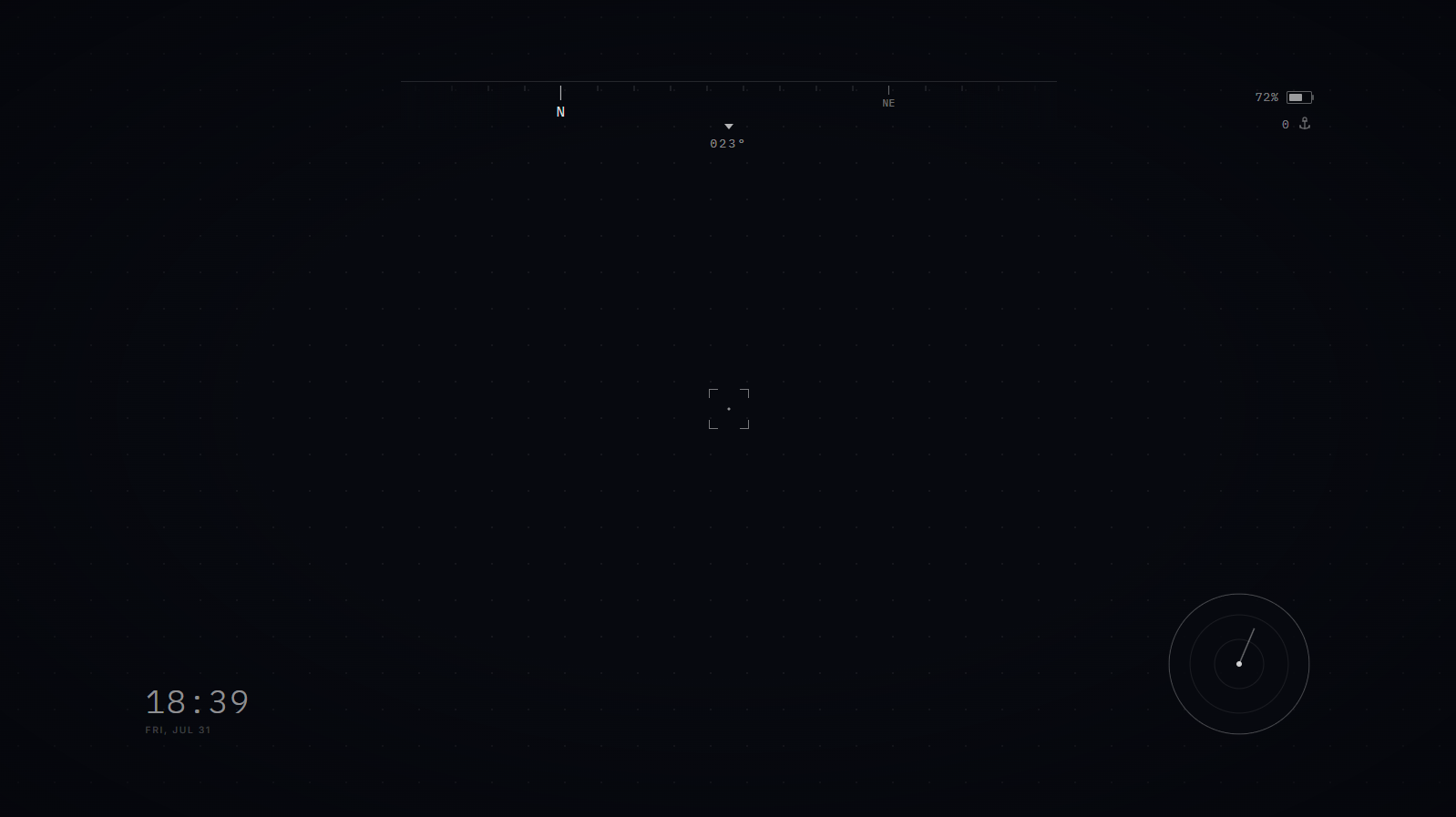
The final Figma Make iteration. The HUD is still too light and small, and it's not grouping elements together logically. Maybe I could keep prompting it but I'm not confident in its ability to do what I want anymore.
So I eventually gave up and designed it exactly to spec manually. I connected my designs to Claude with the Figma MCP so Claude and I were on the same page. My Figma design looked like this initially:

My initial Figma HUD designs. These would change after testing the first prototype in MR.
Unity Setup (Hour 4-6)
Claude directed me to set up Unity and download Meta's VR toolkit that allowed us to hit the ground running with passthrough and hand tracking.

Building the Core Loop (Hour 6-14)
Claude suggested we build the core tagging functionality first, which included head-aiming with a reticle, depth raycasting to place markers on real walls, world-anchoring them, and line-of-sight dimming.
The process was basically me prompting Claude to help me get through Unity.


Early version of the compass in Unity
At times I would ask for clarification or report a problem but generally things were smooth and easy, albeit tedious. After about a full workday of this process, I had a rough MVP!

But testing proved the systems to be over-complicated; trying to aim my head at a specific point in space and line up my finger pointer with the center and pinch all at once to add a marker was hard. Removing markers was incredibly painful sometimes, too.

Part of the problem was the main cursor's complexity; there were too many states and functionality was hidden behind a contextual hover state.
.png)
Default, Add, Select marker, and Remove cursor states—way too complicated in hindsight.
Reworking Things (Hour 14-20)
After testing, it was clear some things needed to be changed:
Rework how markers are added and removed
Move the marker tally from the right side to above the compass
Scrap plans to add a top, horizontal compass (it was redundant and just added clutter)
So I reworked the HUD elements. These changes simplified the UI and reduced frustration on core functionality.
.png)
Redesigned HUD layout

New, simplified center cursors.
Further Testing & Polish (Hour 20-24)
Further testing revealed some minor quality of life UX issues, like time and tally numbers needing a maximum value to prevent overspilling its boundary in the UI. Or the opacity of hidden markers. Or the detection radius of markers. I also added a menu to automate tedious tasks for demos.
The last bit of polish took a lot longer than I thought. But I'm happy with how it turned out.
Feature Showcase
Location Marking
Location marking features:
Add or delete markers (hostile or friendly)
Markers persist through walls (but will not stick to moving targets)
Markers have full opacity when users have line of sight; reduced opacity through physical objects
Marker details surface when marker is centered in user's view
Marker picker (and delete option) is always available

Adding and removing a Hostile Marker to my cat. She deserves it.

Markers change opacity when losing line of sight to prioritize more "urgent" threats.
Design rationale: The markers themselves were thoughtfully designed for superior legibility and recognition at a glance. Hostile markers are red and triangular, appearing visually sharp and unfriendly. Friendly markers are green, hollow, and rounded, appearing relatively more gentle. These intuitive characteristics help users learn and recognize marker types faster even if colorblind. Moving the marker picker to the bottom of the UI slightly helped affordance and made adding markers a lot easier instead of hiding them behind a contextual cursor.
Minimap Compass
Minimap features:
Displays user's directional heading in conventional cardinal directions and degree azimuth
360° spatial representation of all nearby hostiles/friendlies
Tally of hostile and friendly markers
(Note: Compass is for demo purposes only because the Quest 3 has no magnometer)

See all marker information in one place

Markers rotate around the user and change distance as the user moves.
Design rationale: The minimap is entirely user-centric, featuring (1) a map displaying markers in 360° around the user for easier target acquisition and (2) a compass displaying the user's direction. The compass and markers revolve around the user, and the large heading letter and degrees match the exact direction the user is facing. The direction letters rotate but remain upright for superior legibility at a glance. A dotted line extends out from the user to help them align their sight with a particular azimuth or marker. A smaller concentric ring exists to help the user estimate the range of the markers on the minimap. For this demo, the ring signifies a 4m range but for an outdoor system, this could be adjusted to any range that is useful. The marker tally sits right above the compass to summarize the marker information without looking elsewhere on the HUD.
Demo Features
For quick demonstration purposes and a better UX, I included a menu overlay featuring:
Adding random markers in world space
Deleting all existing markers in world space
Leaving the app

Adding tons of random markers for quick demonstration purposes.

Removing all world space markers with one pinch.
Next steps...
Here's what I'd do differently in hindsight:
Implement controller support (currently hand-tracking only)
Experiment with adding markers where I'm pointing, not where I'm aiming
Add an intro screen on startup with a lightweight tutorial
Conduct usability testing with other hobbyists

See more work

