Rethinking Highway Entry Signage
Making highway entrance signs easier to understand (without more text)
(Feb 2026 · 5 minute read)
Summary
Industry
Technology
UX Research
Responsibilities
Research
UI design
Timeline
Q1 2026
Designed replacement signage for highway entrances as a passion project. The redesign makes identifying cardinal directions easier on drivers by relying on color and iconography, and less on text. The result is more accessible signage that can be understood from longer distances by more people.
Highlight: My "final" design met all the requirements and still failed in a real world setting. I went back and I realized the requirements were incomplete. Testing a prototype can help reveal valuable flaws before it reaches a polished state and fails. Research and planning are crucial.
Skip to final design
Context & why it matters
US roadway signage is an example of large-scale UX design in action, merging color theory, typography, psychology, engineering, and more to communicate crucial information to millions of unique drivers. It's super impressive.
Yet because of its highly regulated and ubiquitous nature, roadway signage can easily feel like it's already perfectly optimized, making critical redesigns unnecessary. But as a product designer (and someone who despises traffic), I am always looking for ways to improve things, even subtly, and I believe roadway signage can improve, even slightly.
But why? Why are small improvements on mundane things worth it? For me, it sets a precedent where nothing should ever stay as “good enough” forever. Obviously design priorities exist, but ideally we strive for continual improvement and iteration, even on the mundane stuff—an improved, accessible, empathetic UX is always worth it.
Problem
One day recently, after accidentally entering the wrong highway entrance for the millionth time, I thought to myself, “There has to be a better way to mark North, South, East, and West highway entrances to avoid wrongful entry”.
I think the problem is pretty simple: We rely on small text signs to figure out which highway entrance to take.
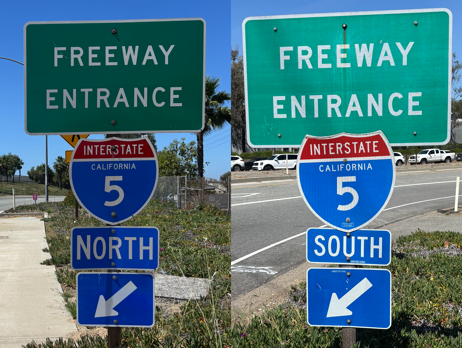
But that’s not always easy: reading them can be tough in bad weather, at night, at high speeds, or at a glance. Failure to recognize the text can lead to wasted time, wasted fuel, and frustration. Ultimately, it’s a text/legibility issue, and I think we can do better.
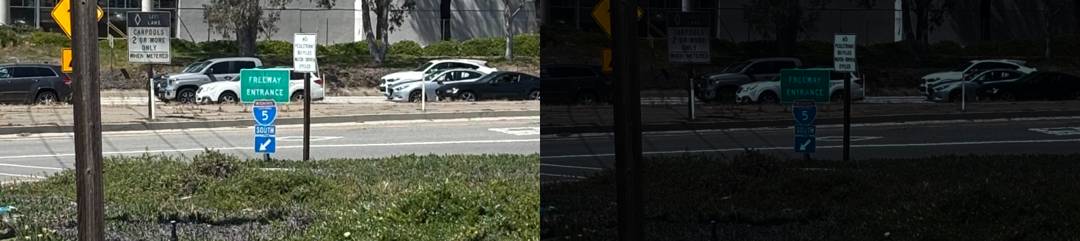
Small text is hard to read from a distance, especially at night.
Approach
I wanted to lean into the “recognition over recall” heuristic for this redesign—I believe failure to recognize the text is at the core of the issue, so the redesign should rely more on iconography. This would also help people who don’t know English, like international drivers.
I did research on US highway signage standards (MUTCD) to help me stay within established regulations. Then, I set ideal requirements.
The redesigned sign must be:
Extremely simple visually
Understood as a navigational cue
Visible from longer distance
Understood without English
Compliant with existing regulations
Exploration & discovery
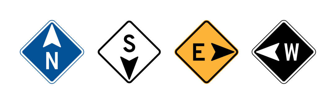
I chose a compass as the foundation of the icon; it’s ubiquitous and inherently communicates navigation. After hundreds of rough, exploratory designs, some insights emerged:
Designs that included every aspect of a conventional compass (like a central arrow that always points north) were unhelpful or too complex.

Designs that were too abstract lost that grounded, innate sense of navigation.

Designs that showed promise had four distinct quadrants, and an arrow clearly indicating a cardinal direction.

Adding a word or letter helped ground the design further, adding clarity for English speakers.

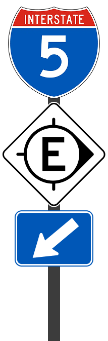
The (wrong) solution
I settled on this design because it technically fulfilled all the requirements.
But in real world context, it falls apart. Here’s why: highway entrances often include an arrow sign pointing to the entrance itself, so the arrow in the redesign conflicts with the existing arrow sign, causing confusion when they point in different directions (which they often will).
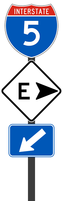
Is this entrance left or right? At a glance, it's ambiguous.
Humbled, I accepted that my redesign actually introduced new problems. Context must be considered for the final design, so I updated the list of requirements and to add that it must:
Integrate with existing signage
Solution 2.0
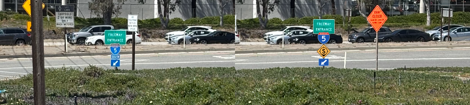
I played with making the arrow more subtle so it didn’t visually compete with other parts of the system. I quickly arrived at a possible solution.


The cardinal direction is still heavily biased compared to the other quadrants, but the arrow has a much lower visual pull/hierarchy, allowing the other arrow to take immediate priority. I also introduced a circle to the design, which helps ground it as a compass indicator. The large font helps with distance legibility.

I feel good about this iteration; all the requirements are fulfilled and the sign now conveys direction to more people with less text. Plus it all fits nicely in a square sign.
From a distance, "SOUTH" in the original (left) is harder to read than "S" in the redesign (right).
Blue, yellow, black, and white are the best colors for this because they:
Offer high contrast/legibility
Avoid all problematic colorblind pairings
Do not conflict with current roadway color conventions
Final thoughts
The signage is an improvement from the current design, especially when it comes to long distance legibility—I am able to differentiate N, S, E, W much more easily. Plus international drivers can decipher the meaning based on the icon's arrow.
I concede that, like any redesign, people will need time to adjust to it. This concept would need testing with real drivers to validate its effectiveness and impact.
I have a lot of respect for current roadway signage and its designers because of how consistent, complex, and interconnected every part of roadway signage is, but I believe my contribution is a step in the right direction to make roadway UX slightly better.
Back to all work
© 2026 Alexander Kempf
(Call me Alex)