

How can we help researchers get better study data (and improve the participant UX)?
Increasing Participant Retention and Study Efficiency
Pulse Labs AI
TL;DR
I redesigned the mobile flow our customers use to study how people use technology in everyday life. I pitched a new way to record study tasks that cut a lot of user friction.
Result: Our product reduced its tech debt, saving our internal support team saved hundreds of hours of customer support, and our customers got better research data.
Highlight
The way we recorded tasks was blocking key parts of a better experience, so I went to the developers and pitched a different approach. It was a hard rebuild for both teams, but it cut our tech debt and made the product far easier to use and better at gathering data. A better user experience is always worth the extra effort.
Note
The exact, quantitative effect of our product remains confidential to the clients so my success is evidenced in their continual reliance on the features I designed that help drive million-dollar product decisions.
Role
UI design
Interactive prototyping
Developer handoff
Collaborators
Design Lead
Researchers
Developers
Timeline
Q1 2024

Context & Problem
Pulse Labs' main product helps researchers run studies and record participant input to find product and user insights. A big part of these studies has participants record themselves doing set tasks through the Pulse Labs app, which researchers design carefully to test usability.
When I joined the team, the flow for recording tasks was horrible. It required participants to do a host of tedious actions, including:

Copy/paste the tasks to another app (or write them down) for future reference
Don't return to the app for help until recording is over
Inability to restart a single task recording at the end of a session (must upload or restart all)
After uploading, manually set the start/end timestamps of each task
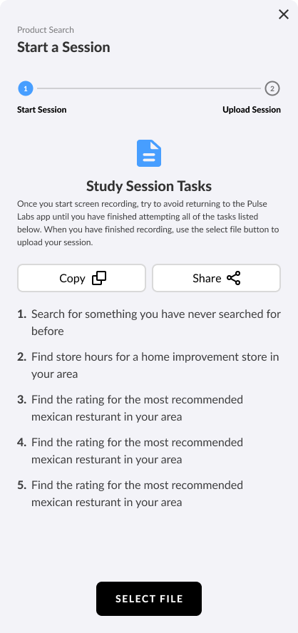
Original directions
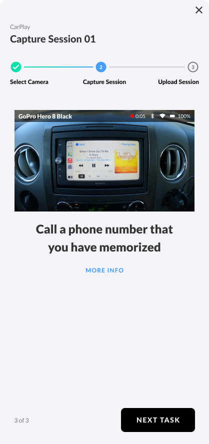
Original task
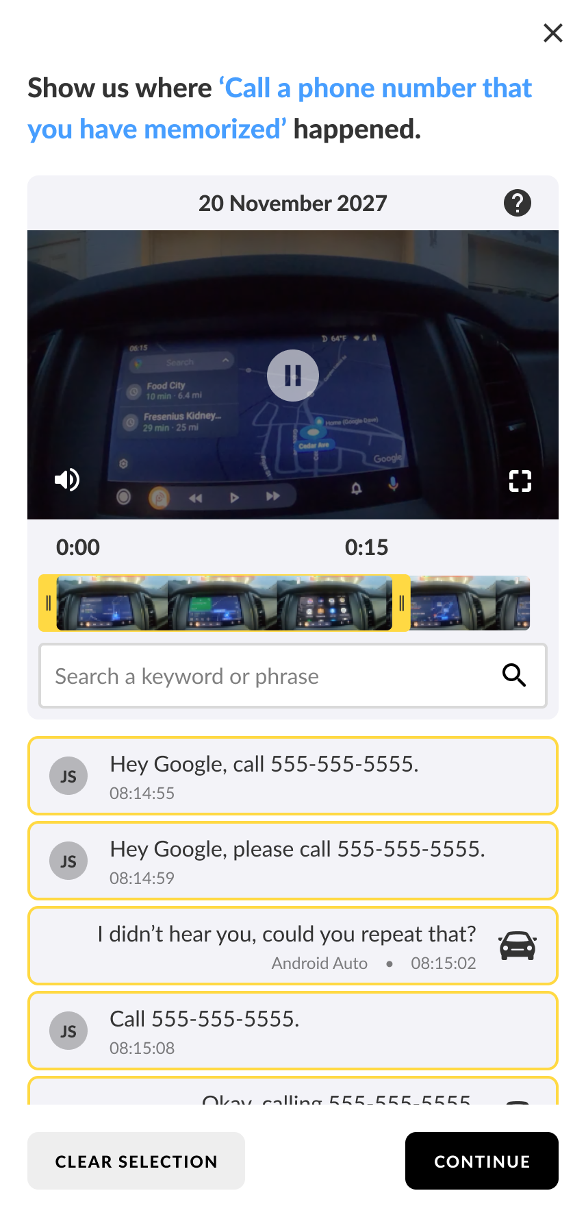
Manually set timestamps
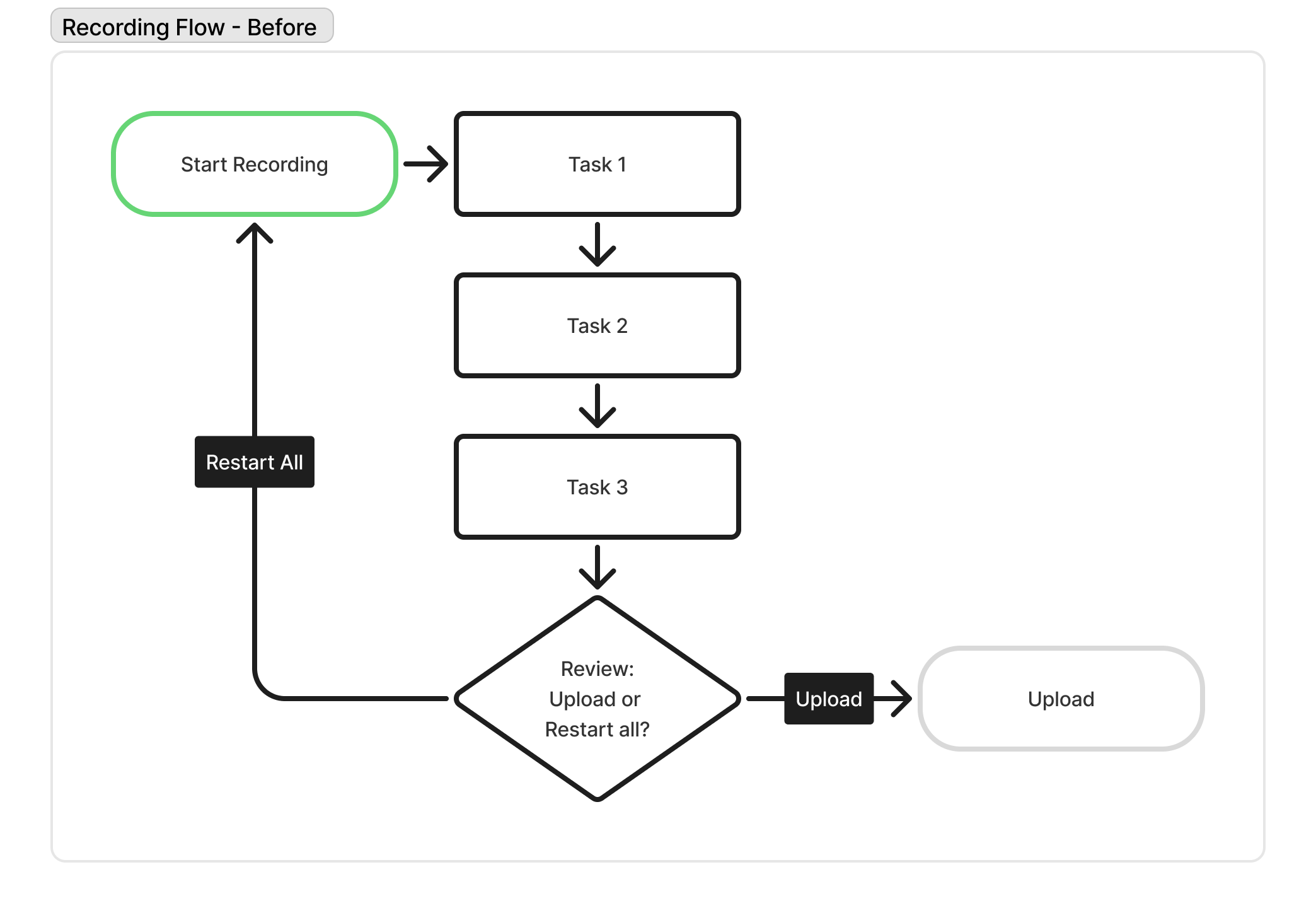
Simplified recording flowchart showing how participants can't go back to a previous task. After recording, participants must upload all of them or restart all of them.
This made it easy for people to make mistakes and get frustrated, which hurt both the research data and how many people stuck with the study.
Process
Recording methodology
I studied the old flow and found the real issue: the system recorded everything as one giant file. I brought this to engineering and pitched recording each task as its own small file instead. That single change fixed most of the friction:
Automatically timestamps each task (instead of forcing the participant to manually and tediously do it)
Makes restarting (re-recording) individual tasks possible
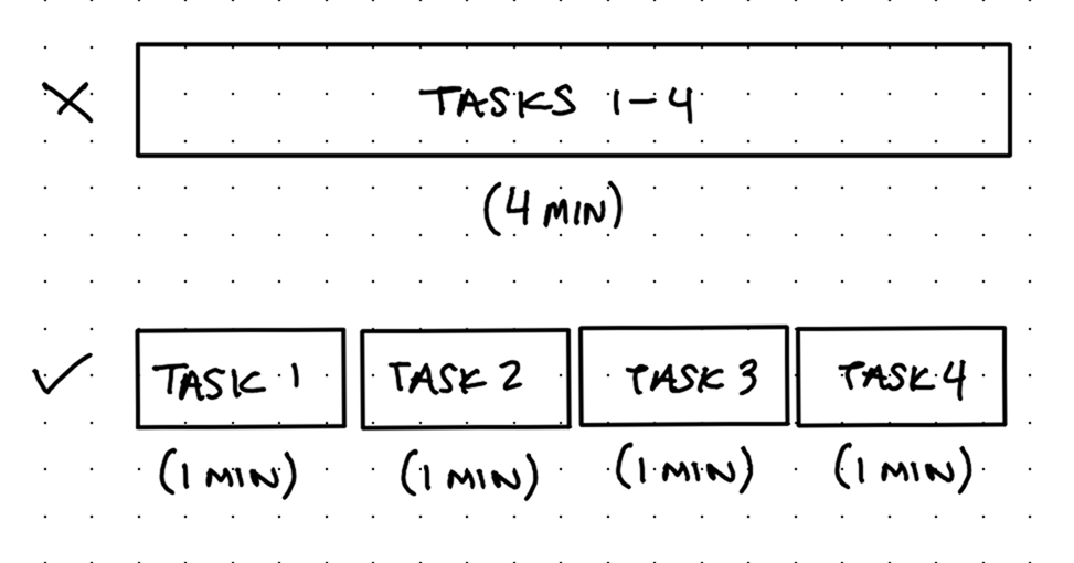
Instead of recording one big video, several smaller videos (one per task) would fix many UX issues.
Engineering confirmed it was possible, which opened the door to a much better experience.
Feature requests
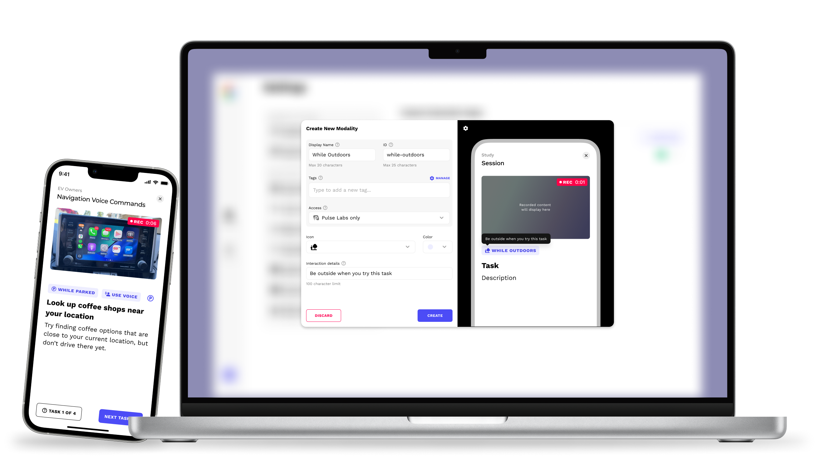
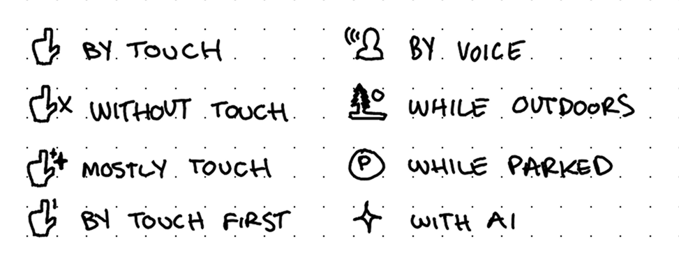
A few other requests made sense to build alongside this. Researchers wanted a way to show "modality," meaning how a task should be done, like "with one tap" or "while parked," without cramming it into the task text.
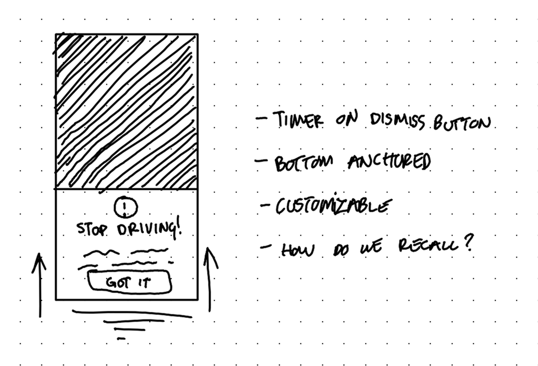
My design lead also wanted a "context prompt" feature, letting researchers add extra directions before certain tasks.
Empathy mapping
I also put myself in participants' shoes and asked what would make recording feel less like a chore. That led to four more ideas:
Time and equipment requirements screen before starting
Camera setup assistance before starting
Customizable researcher tools
Review individual tasks before uploading
All of these concepts respect the participants' time and the effort put forth by the researchers in pursuit of naturalistic data.
Review methodology
I first assumed reviewing after every task would work best, but that idea felt clunky on paper since it interrupted the flow constantly.
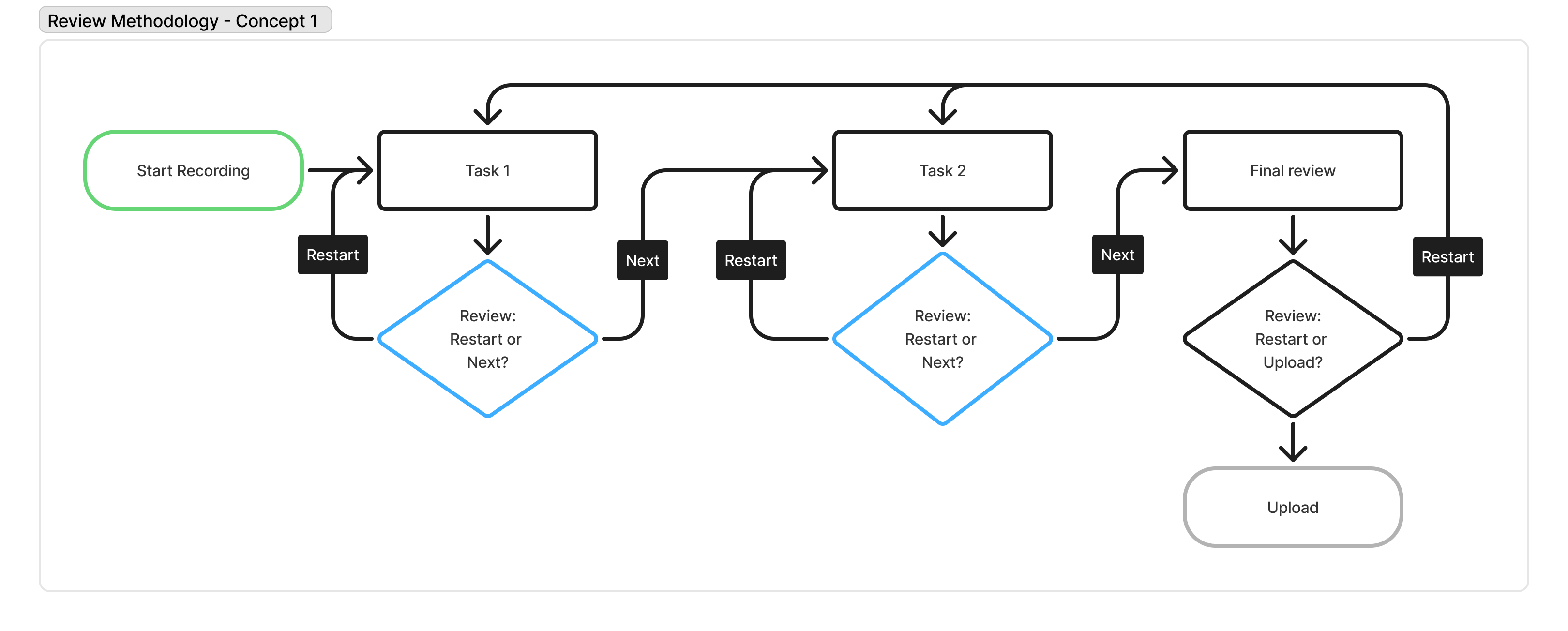
Blue decision diamonds show a review after every task, but it interrupts the flow between tasks too much.
I landed on one optional review screen after all tasks are done, right before uploading, so participants can fix a mistake without breaking their focus mid-recording.
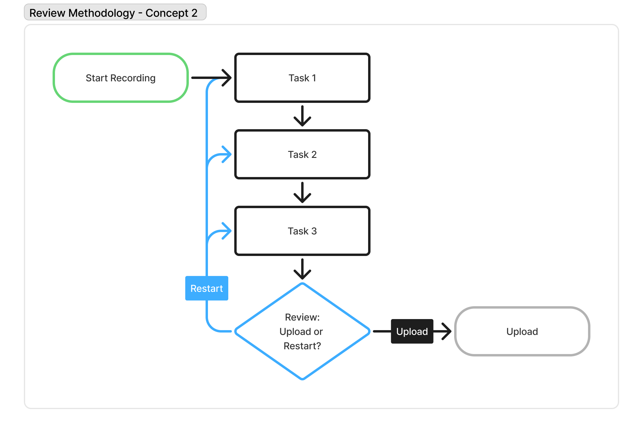
The blue arrows show the difference; the ability to go back to a specific task and restart it.
Solution
Note: Another designer had recently refreshed the design system assets, so that's why these newer designs look so different from the original.
Here's how all the ideas, requests, and designs came together to help researchers get better data from their participants:
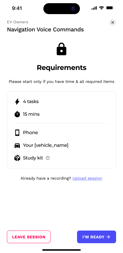
Requirements screen
Leads every recording session
Helps participants know what to expect and if they're ready to safely start
Why: First defense against rushed, incomplete, or low-quality testing data

New

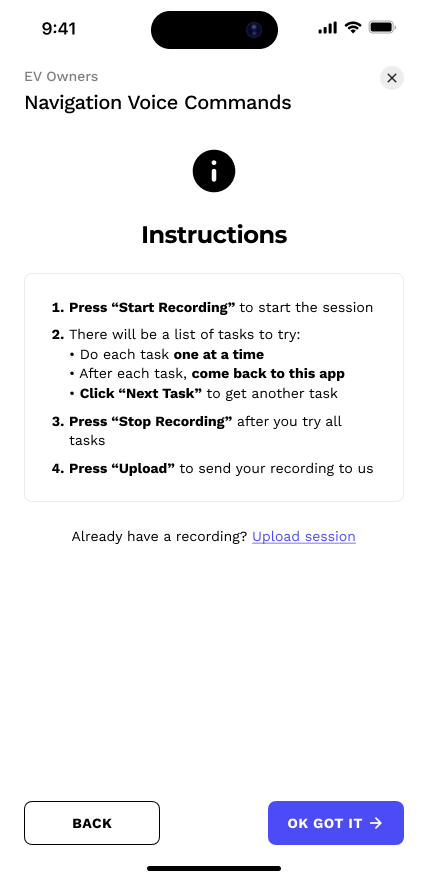
Instructions screen
Updated
Lacks the embarrassing request to copy/paste the tasks to another app (from the original version)
Reminder to tap "Next Task" after each task to automatically segment their recordings properly
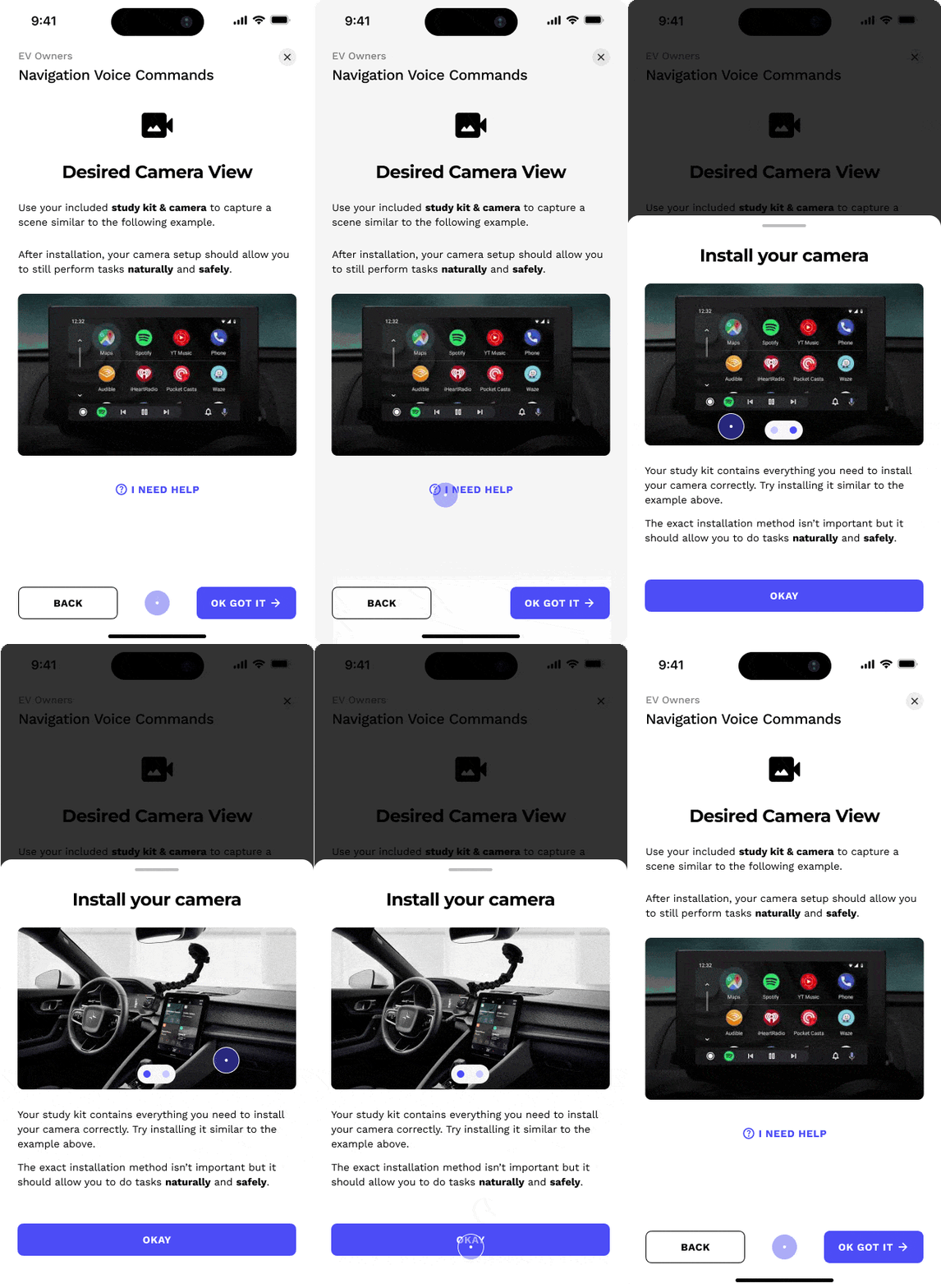
Camera setup help
New
Contains images to assist participants with safe, proper camera setup
Why: Helps researchers get a clear, proper view of the task
Why: Helps reduce participant frustration and subsequent support tickets (or dropouts)
Modality
New
Informs participants about how to conduct a task, helping researchers get more consistent, nuanced task data
Above and separated from the task itself, improving its hierarchy and likelihood of being seen, thereby priming participants on how to approach the task
Why: Conveys researcher intent, reducing bad test data
.gif)
Context prompts
New
Bottom-anchored modals that appear before tasks (when applicable)
Can be recalled at any time
Communicates directions beyond the task itself (such as switching apps mid-session or spending a certain min/max time on a task)
Confirmation button is on a short, 3-second timer to prevent participants from speeding through without reading it, but doesn't feel like a long, tedious barrier either
Why: Conveys researcher intent, reducing bad test data
.gif)
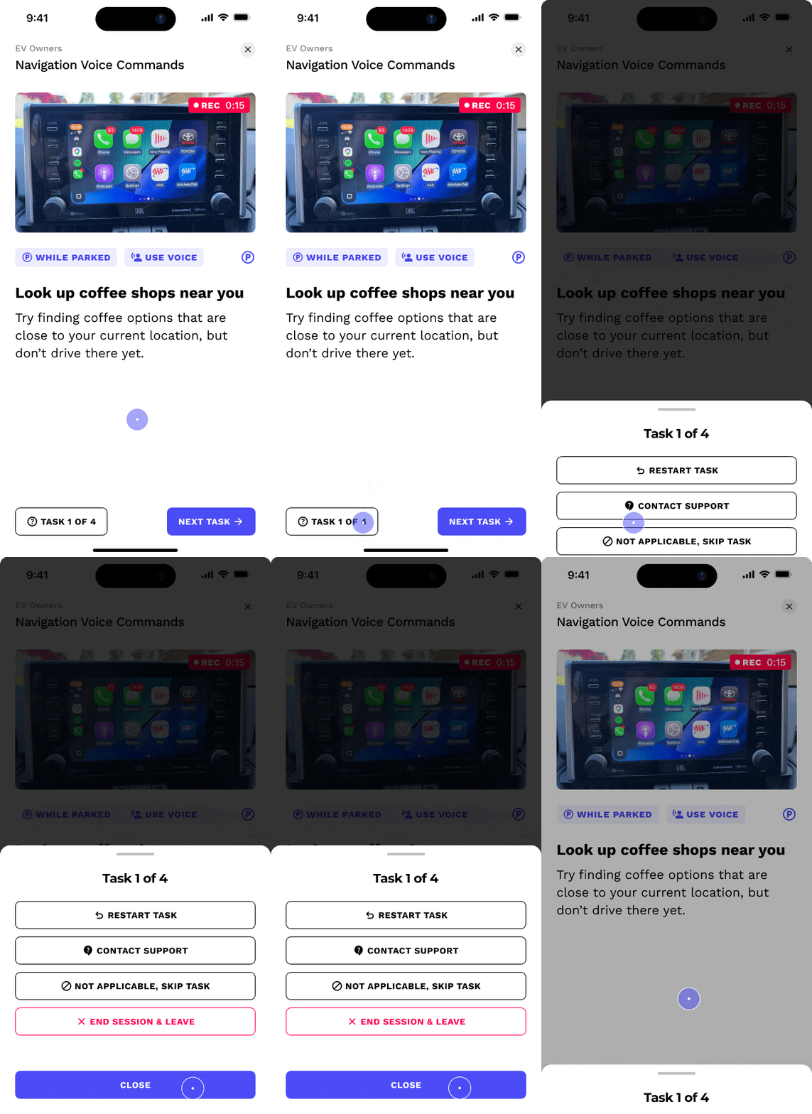
Task help
New
Button that simultaneously tracks progress and gives participants help options mid-task
Allows participants to restart a task if they make a recording error
Allows participants to contact support for more help
Allows participants to skip a task if the task is not applicable to them or their product
Why: Helps reduce participant frustration and subsequent support tickets (or dropouts)
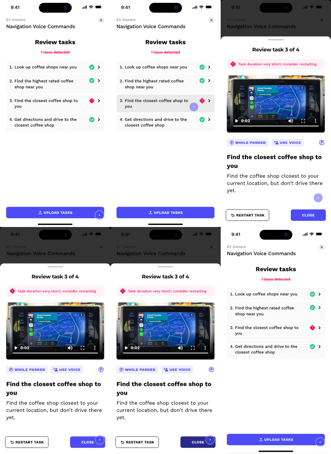
Review
Updated
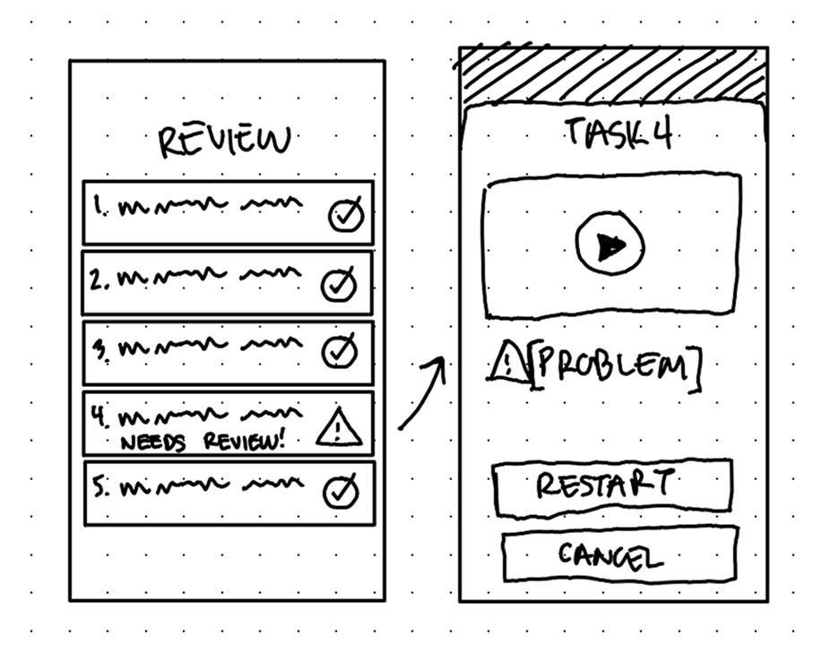
Automatically detects and surfaces recording issues to the participant, such as if a task is too short, too long, or corrupted
Allows participants to restart recording a specific task in the list, instead of restarting all of them
Why: Helps reduce participant frustration, bad data, and subsequent support tickets (or dropouts)
Researcher Customization Tools
Beyond the default Context Prompts and Modalities, researchers have rich customization tools to create ones that perfectly fit their research methods.
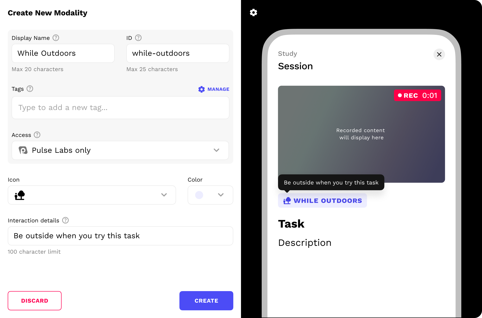
Modality creation & customization tool

Context prompt creation & customization tool
Next steps...
Here's what I'd do differently in hindsight:
A/B test my review approach against reviewing after every task, to confirm it's the right call instead of relying on my own assumptions
Find a way to hide wasted recording time, like when a participant is using the app between tasks

See more work

