

Creating the most flexible, intuitive filters imaginable.
Leveraging AI to Find Better Study Participants
Pulse Labs AI
TL;DR
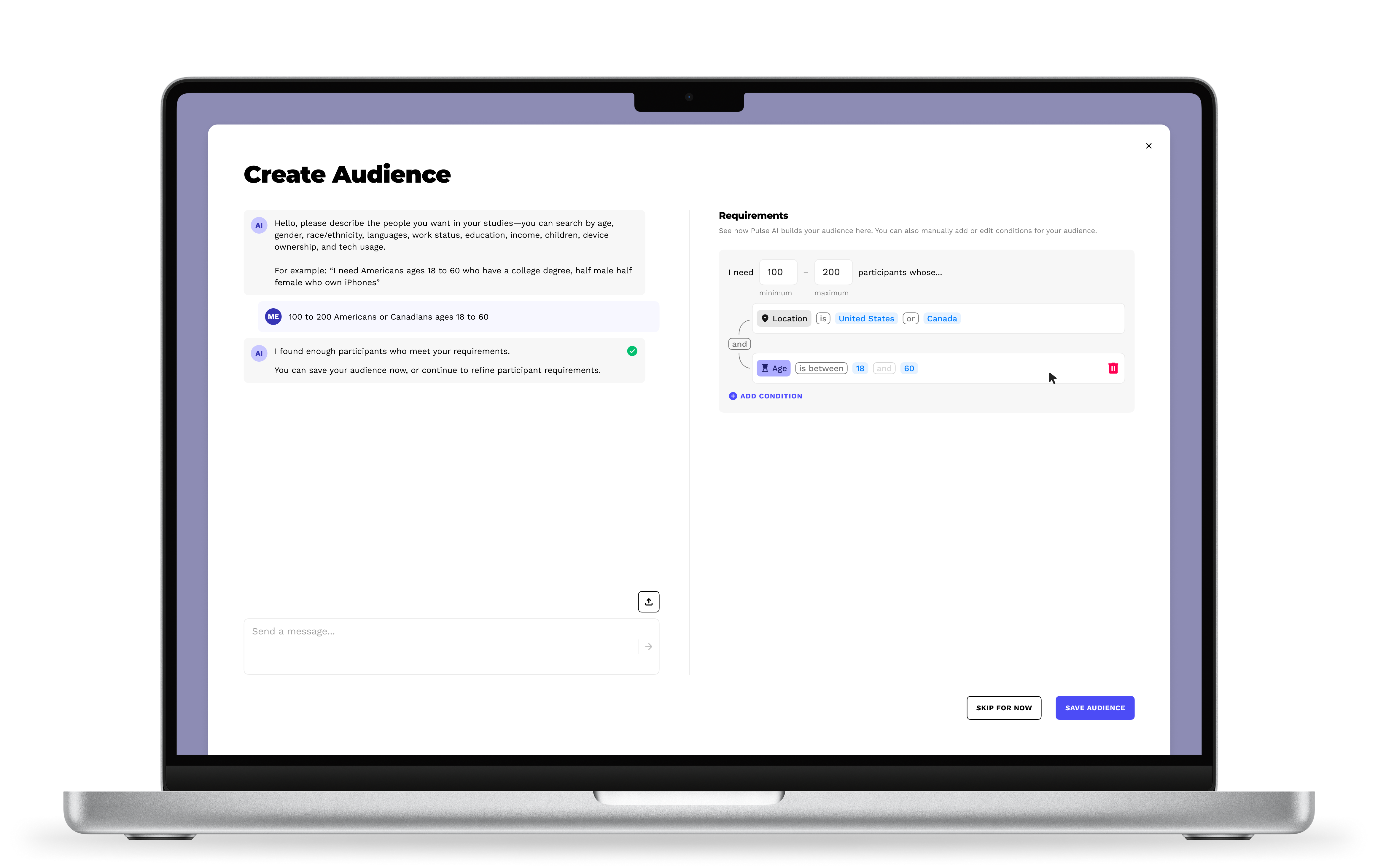
I designed a prototype for Pulse Labs' "Audience" builder. It combines an AI assistant with a manual logic editor, so research teams can filter a large pool of verified research participants for their studies both easily and precisely.
Result: Fast enough for a plain-language request, precise enough for complex criteria, and adopted for high-stakes studies by Google, Amazon, and automotive manufacturers.
Highlight
Leadership wanted an AI-only tool. I saw a chance to push for something better: a compromise that served both the user and the business. I built a version showing how manual editing makes the AI features more precise and easier to use, and it won unanimous approval. Taking ownership of the user experience and finding smart compromises is exactly why I love product design.
Note
The exact, quantitative success numbers are private and belong to our clients. But here's proof it worked: big teams still rely on it today to help make million-dollar product decisions.
Role
UI design
Interactive prototyping
Developer handoff
Collaborators
CEO
Design Lead
Developers
Timeline
Q1 2025

Context & Problem
Pulse Labs' main product connects any product with real users to draw out research insights. One of our biggest strengths was a large pool of eager, verified participants, but that pool was diverse, so we needed a precise way to filter them for each study. Even great research data is useless if the wrong people are in it.
Note: Participants are not clients. Participants are everyday users who get paid for their study participation. Clients are businesses using Pulse Labs' SaaS product to build and run a study.
Before this project, employees had to manually build studies for clients because the tools were too complicated. The CEO's vision was simple: make filtering participants as easy as writing an AI prompt. AI is great when it works. But AI isn't always reliable, especially with detailed requests, like:
“I need 100 to 200 Americans or Canadians ages 18 to 60 who have a college degree, who own Tesla vehicles 2022 and newer, half male, half female”
We needed filtering to be just as simple as an AI prompt, without losing precision. Wrong participants meant wasted data, time, and money.
Process
Championing the User
My team lead and I agreed manual control was necessary. Relying on AI alone wouldn't serve the user well. I built a quick prototype showing how AI and manual control could work together, and the CEO agreed, though he wanted users led into the AI flow first. This way, everyone wins.
My team lead added two more requirements:
Handle abstract prompts that don't fit our preset categories
Warn users if their filters return too few participants
I split the interface into two connected sections instead of one: (1)a place to prompt the AI assistant, (2) and a place to view and edit filters by hand. Users could move between both freely, since showing only one option at a time felt too restrictive.
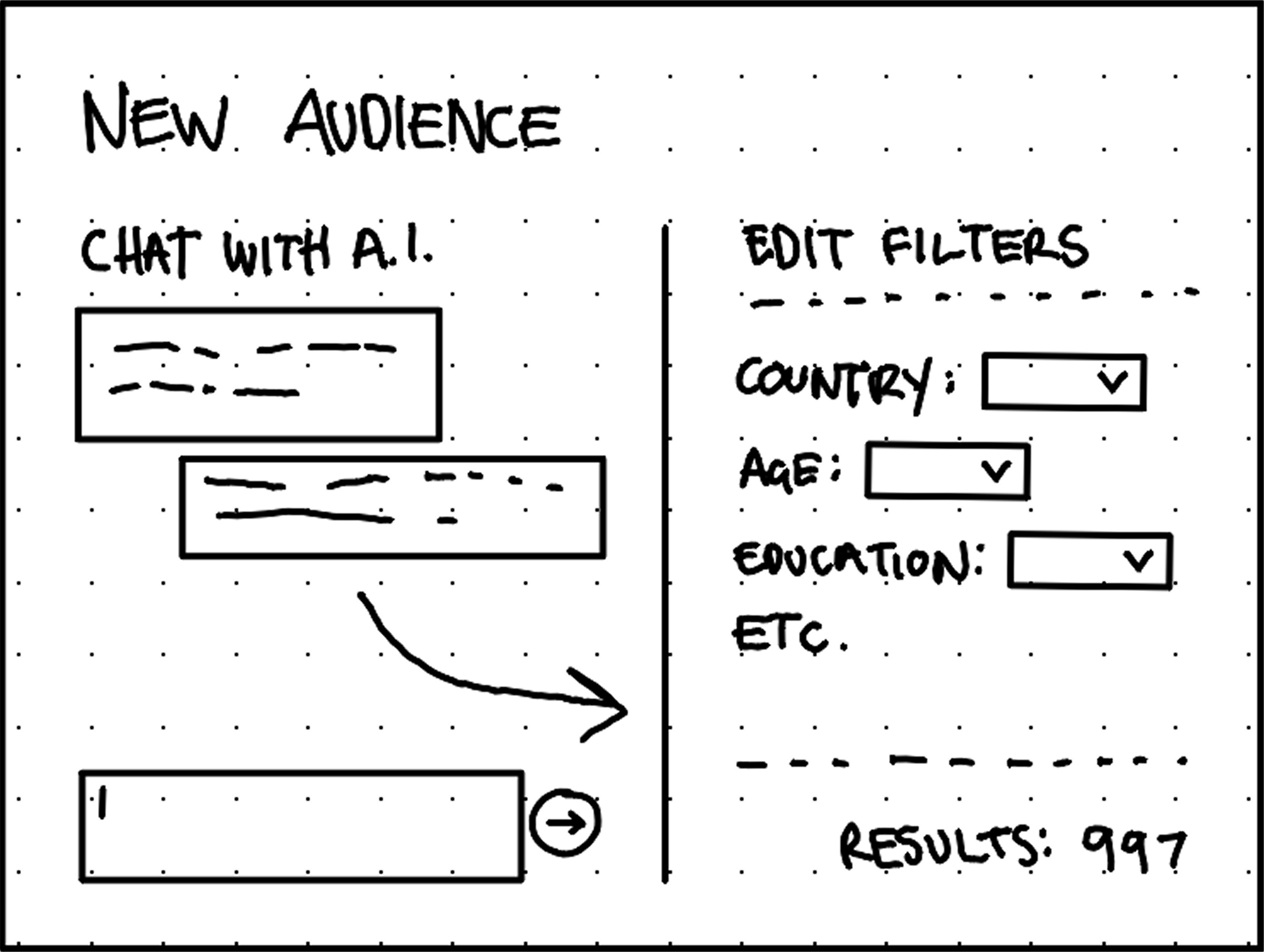
Quick wireframe concept shows filters as independent options and the AI assistant making one-way changes to filters. Spoiler: That would change.
Filter Methodology
Considering all requirements, I felt strongly that a visual logic builder was ideal for these filters because its logical operators allowed for more precision and flexibility than typical dropdown filters. It would also help users see the status of their filters at all times.
I designed menus to reflect our demographic parameters, quantitative equalities/inequalities, and mathematical operators.
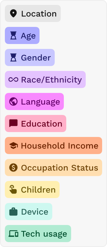
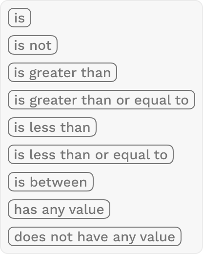

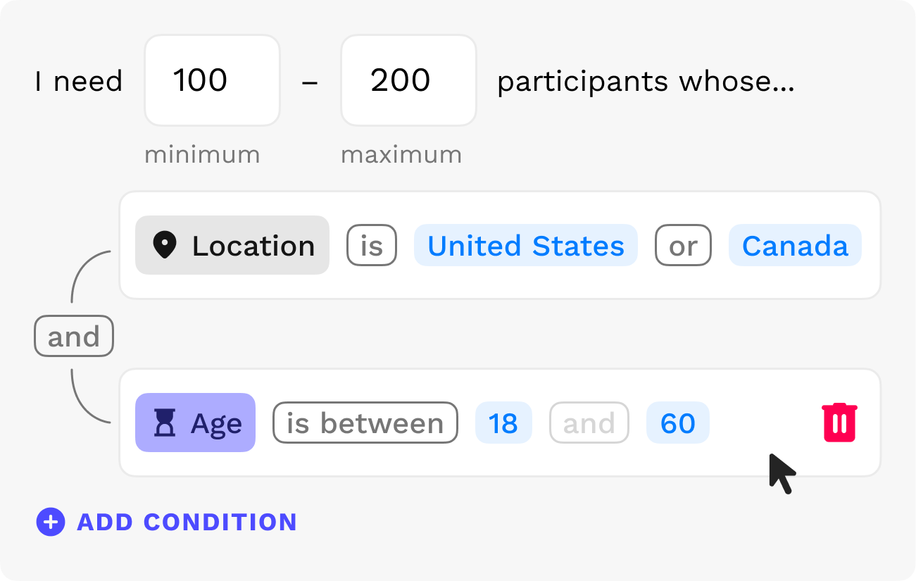
These dropdown components combine to create logical statements such as:

I designed the filter options to read like a normal, conversational sentence instead of programming code, so anyone could understand and adjust the logic at a glance.
Solution
Layout
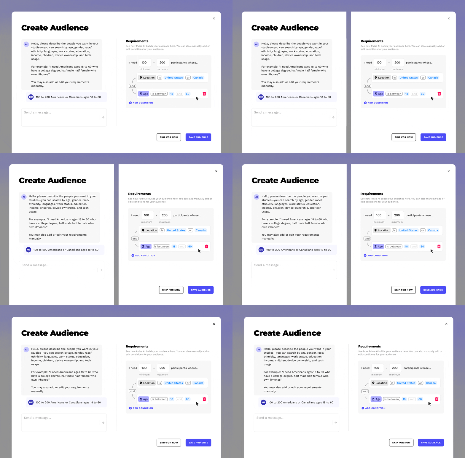
The final design splits into two vertical panels that update each other in real time.
Dynamic Design
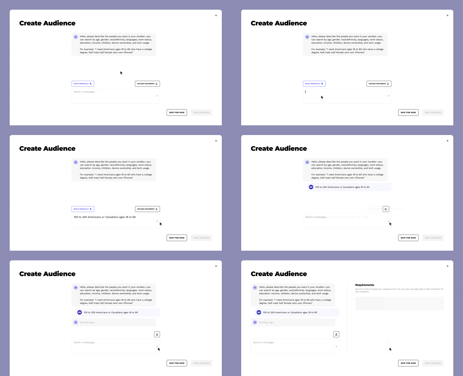
The UI leads users with the primary option to enter a prompt describing the kind of participants they need with the AI Assistant. This makes building complex filtering very easy. Secondary options to build manually or upload a document (like a business brief) are also available.
Note: The "Build Manually" option disappears because manual edits become available elsewhere in the UI. The "Upload Document" button minimizes because it's no longer the user's main option for AI communication.
After a prompt is entered, the UI splits into two distinct sections separating the AI Assistant (left) from the Logic Builder (right).
After a valid prompt, the AI assistant builds the filter logic in real-time, allowing the user to see exactly how participants are being selected.
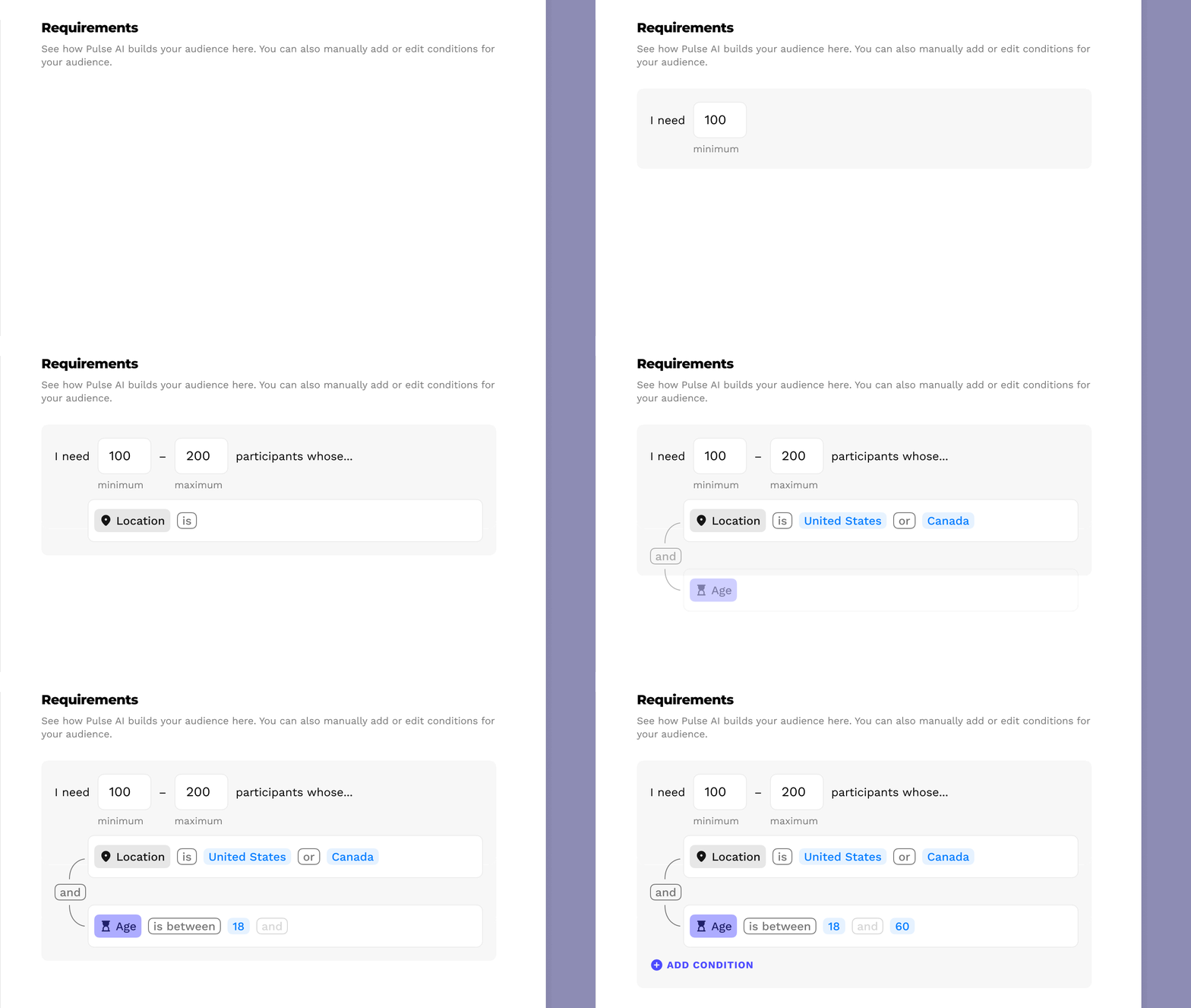

The AI Assistant will give users feedback about their prompts and filter logic, such as if enough participants are found or if there's an invalid prompt request.
Users may manually change the logic at any time to suit their needs or correct issues from the AI Assistant due to ambiguous prompts. This grants the ease of prompting with the flexibility of manual control.
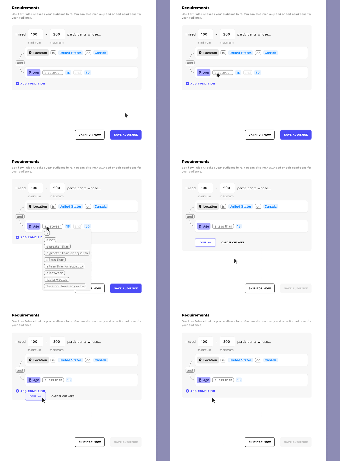
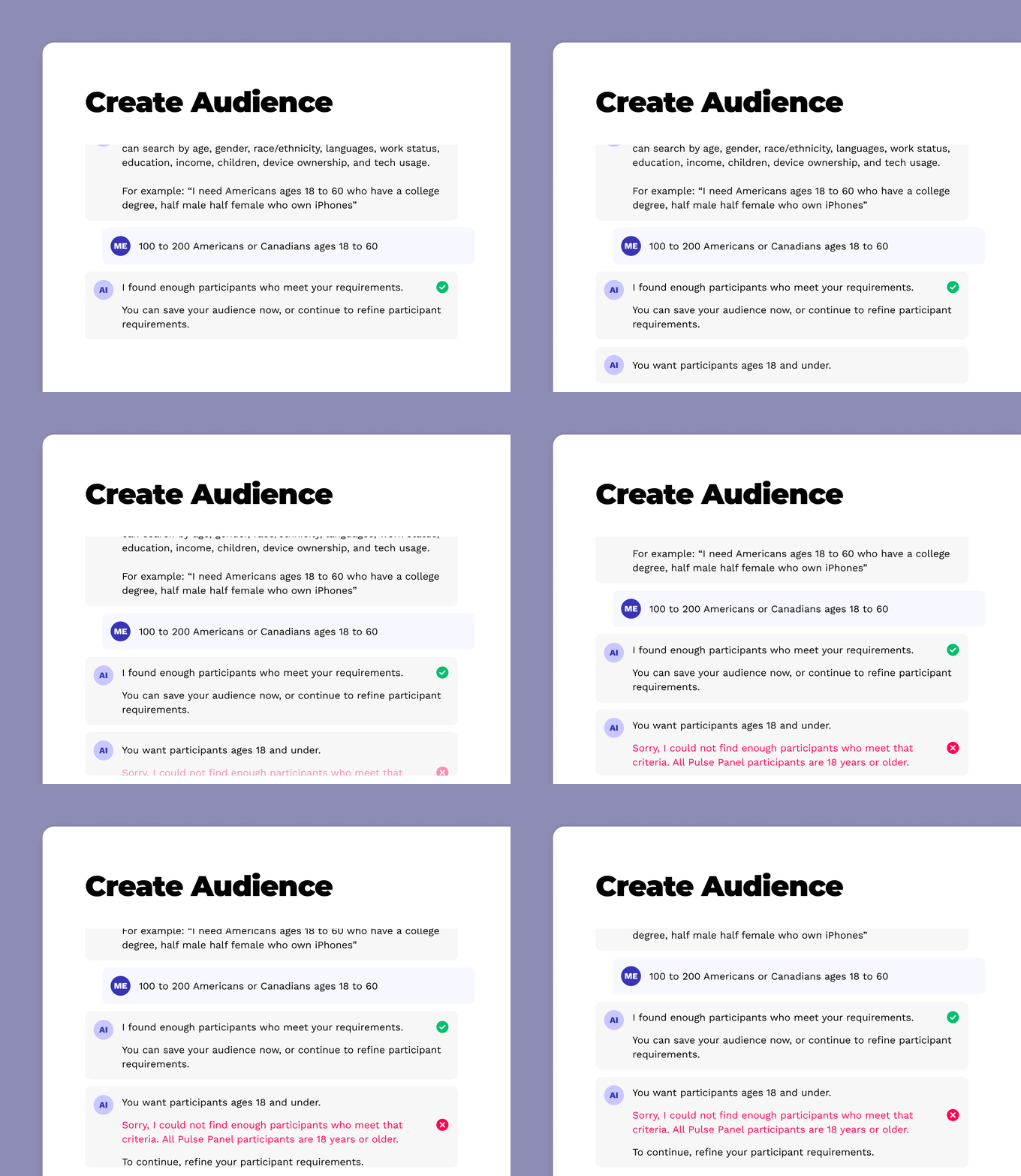
Even after a manual change, the AI Assistant will confirm the user's input and give feedback so the user is never confused about what to do next.
These reciprocal interactions give the user visibility of the system status and continual feedback no matter how they choose to build their filter logic.
Edge cases
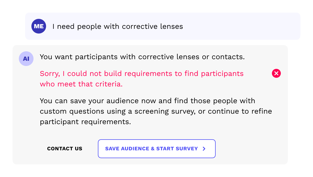
If the prompt cannot be described by our predetermined parameters (too abstract), the AI assistant will suggest an entry point to a screening survey.
Next steps...
Here's what I'd do differently in hindsight:
Add support for much more complex requirements, with many logical operators, for extreme edge cases
Test the feature directly with our clients

See more work

