

How can a video player help researchers find better insights?
Media Player Boosts Android Auto's Study ROI
Pulse Labs AI
TL;DR
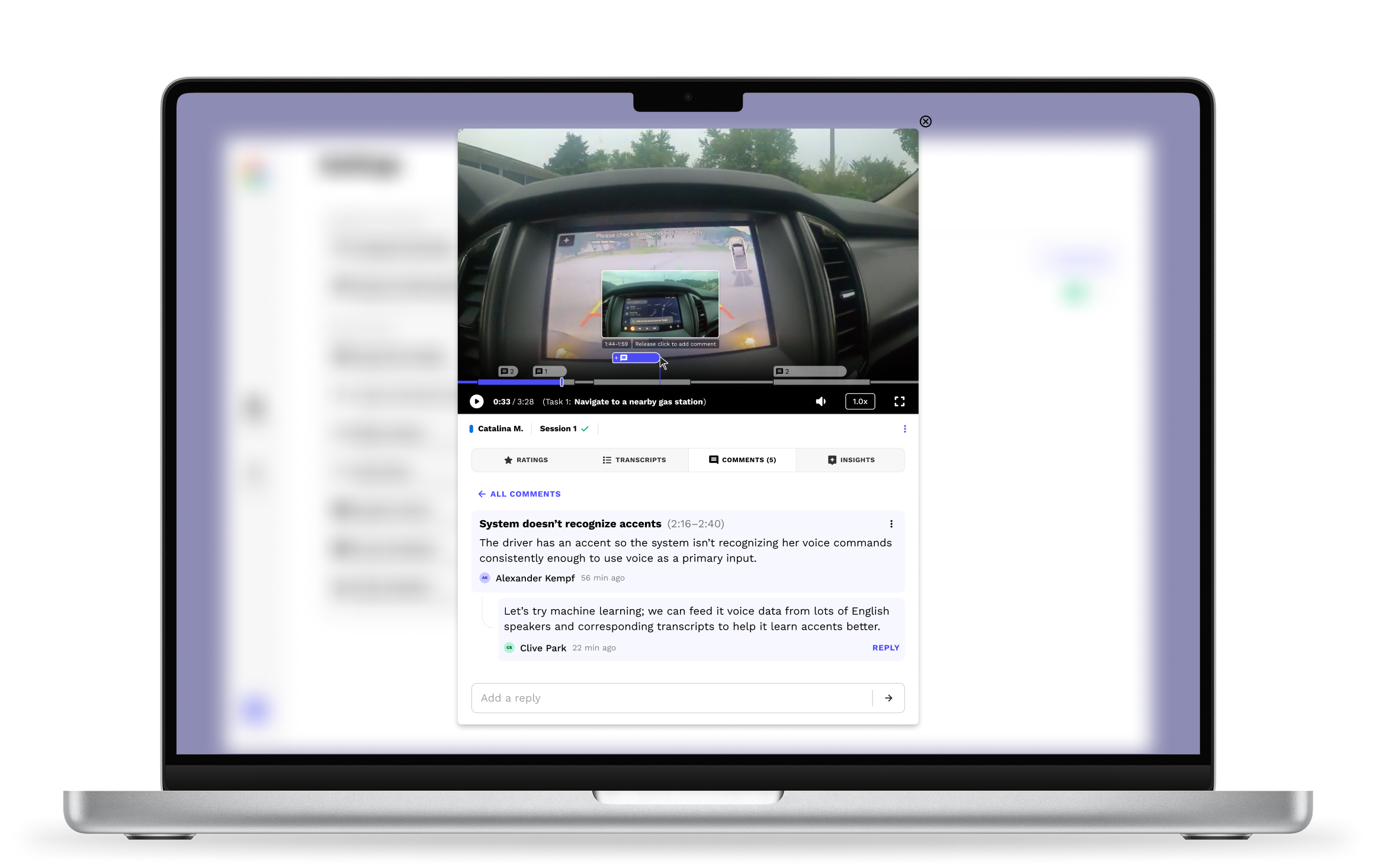
I designed a web-based video player with tools for analysis and teamwork, helping research teams find more insights in their study video and audio.
Result: This feature helped teams find more/better insights, saving them dozens of hours of analysis time and millions in downstream product costs.
Highlight
Google asked for two separate features: (1) a highlight feature and (2) a comment feature. I combined them into one, cutting clutter and making the tool easier to use without losing functionality. Sometimes what a client asks for isn't quite what they need.
Note
The exact, quantitative success numbers are private and belong to our clients. But here's proof it worked: big teams still rely on it today to help make million-dollar product decisions.
Role
UI design
User research
Prototyping
Developer handoff
Collaborators
Android Auto (Client)
Design Lead
Developers
Timeline
Q4 2024

Context & Problem
Pulse Labs makes a tool that helps researchers run studies and record what people do and say from surveys, diaries, tasks, and interviews. Car studies were a big part of this, often with hours of video showing real driver behavior. But our video player could only play videos, nothing more. To take notes, comment, or work with teammates, researchers had to leave the app entirely. That didn't make sense for a product built to help teams find insights.
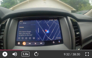
The original media player had ordinary playback features—nothing for deeper analysis or collaboration.
The question became: how do we redesign the video player itself to help researchers find insights?
Process
Research
I met with Google's Android Auto team to learn what was frustrating them. They wanted to:
See exactly where each task starts and ends
Mark interesting moments with highlights
Leave comments
Context matters a lot in research. It's not just what problems users have, but when and how they happened. So I planned to show tasks, highlights, and comments right on the video's timeline, instead of listing them separately.
Exploration & Discovery
I first researched other video players for ideas, then made a list of what the tool needed and sketched a few concepts. My first prototype felt cluttered, especially when collapsed, and lacked any clear hierarchy. Even after I tried using color to separate elements, it still felt busy.
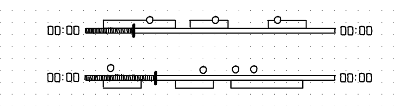

Collapsed: Overlapping elements are ambiguous and overwhelming
Expanded: Stacks too high and lacks hierarchy
Challenging assumptions
So I went back to the drawing board, aiming for simplicity instead: by default, the player shows a clean, compact view; on hover, tasks expand into simple segments with their names shown near the playback time. That cut a lot of clutter.

By default (no mouse hovering), the player shows a clean, compact view instead of every detail at once.

On hover, tasks appear as simple segments on the progress bar, with task names shown below near the playback time. This cut clutter a lot.
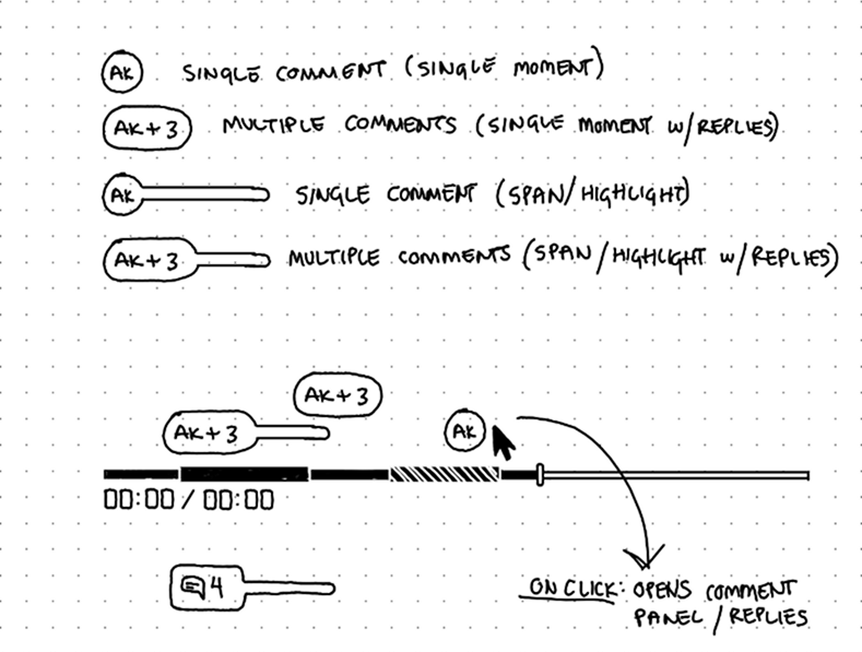
I also realized a highlight without a comment doesn't mean much on its own, so I merged the two. Now comments can mark a single moment or span a stretch of time. That one change simplified the design and encouraged more discussion, instead of adding a whole separate system just for highlights.
Solution
Default states
By default, the progress bar stays compact and easy to scan, with comments shown above it to flag interesting moments coming up. On hover, it expands to reveal task locations and comment details.

Default mouse-leave and hover states
Note: the small gaps between tasks show time the participant spent in the Pulse Labs app, not doing a task. This can vary a lot by study, and it's shown here just for demo and development purposes.
Commenting
Hovering over the progress bar reveals a scrubber and an "add" icon. This is how users add comments. Hovering over that icon shows a small tip explaining how it works: click, or click and drag.
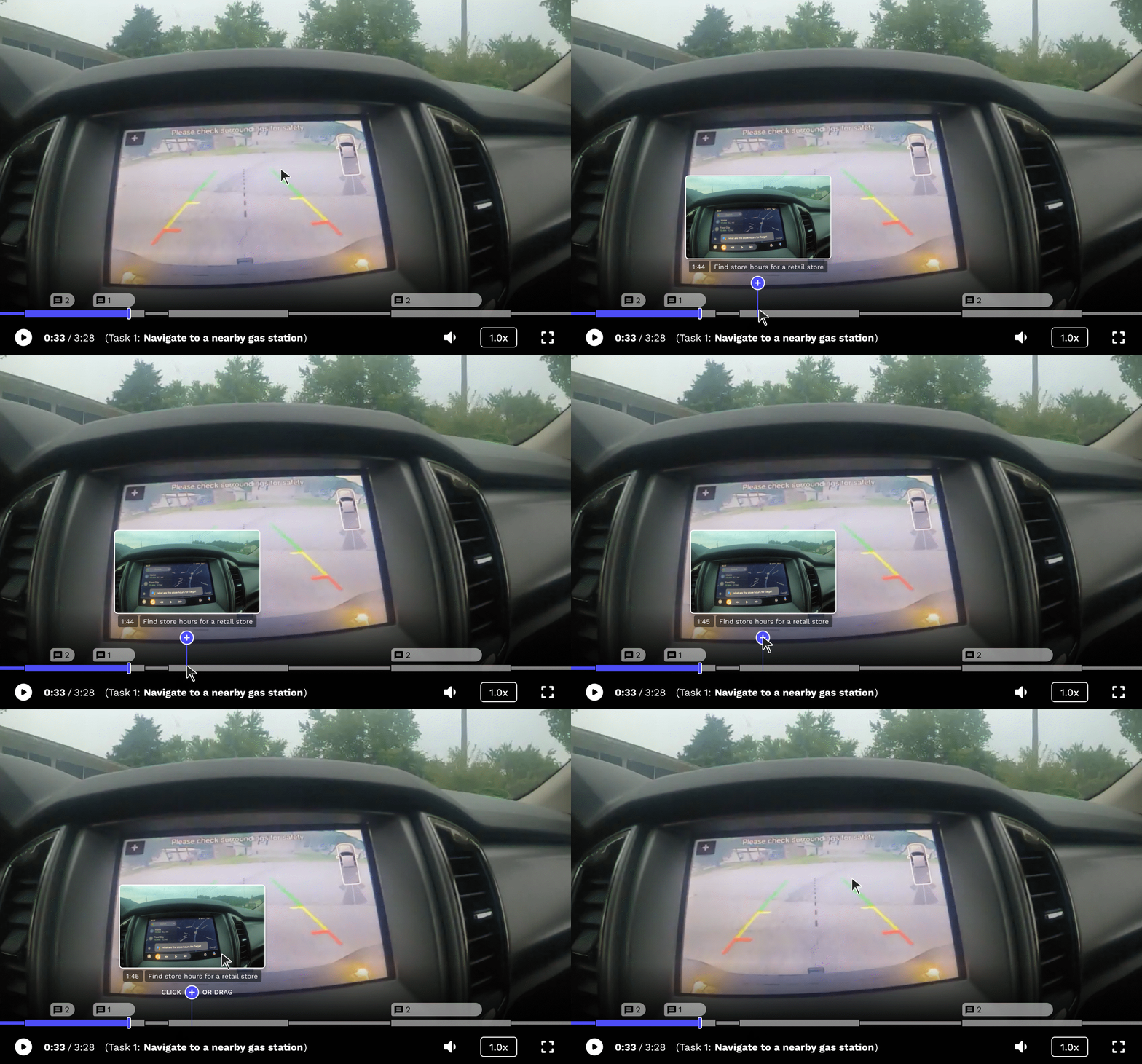
Hovering over the "add" icon shows users they can click or drag to add a comment.
A single click adds a comment at one moment in time.
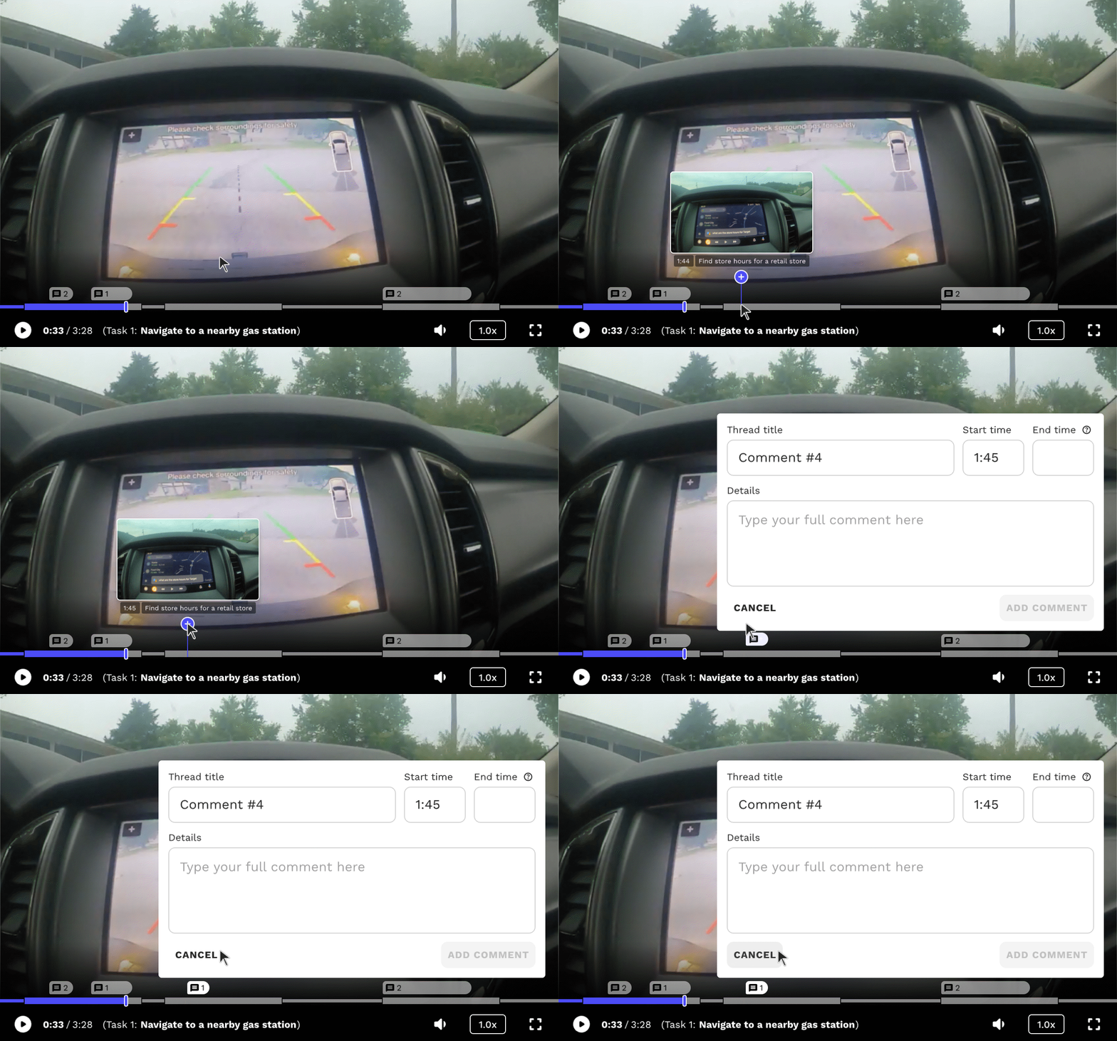
Adding a comment on a single moment in time.
Clicking and dragging adds a comment that spans a stretch of time (taking over the job highlights used to do).
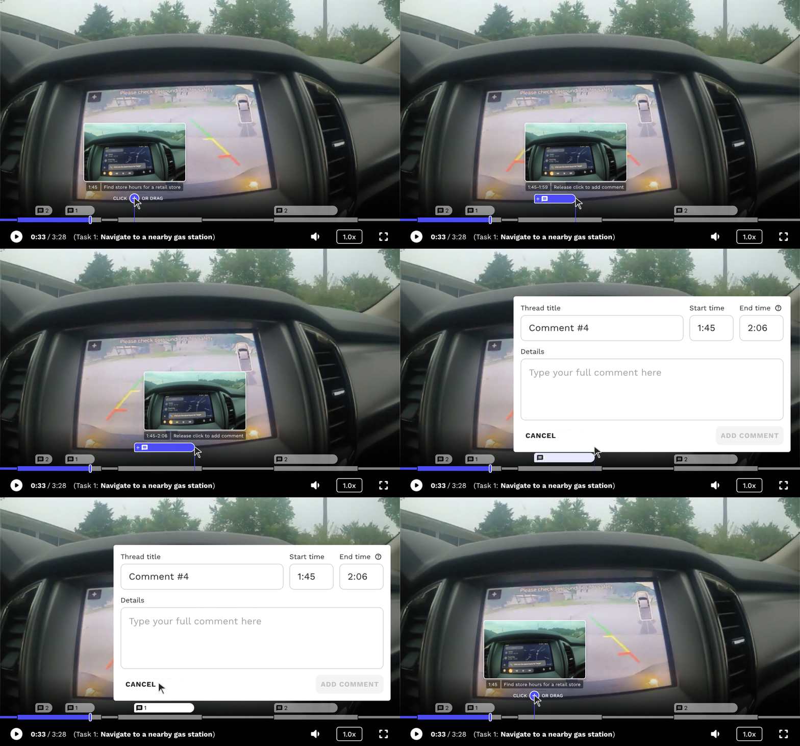
Adding a comment that spans a range of time.
Viewing & Replying
Hovering over a comment shows a short preview. Clicking it opens the full message in the Comments tab, where users can read, edit, or reply. A small number next to the comment icon shows how many comments are in that thread.

Hovering on a comment displays a preview
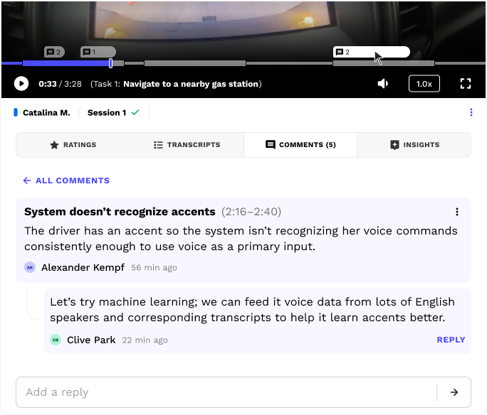
The Comments tab automatically opens when a user clicks on a comment in the progress bar
Together, these features let teams mark up the video and flag interesting moments right where they happen, making it much easier for the whole team to find real insights.
Edge cases
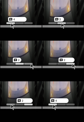
If comments overlap, only the earliest shows by default, with the rest tucked into small tabs users can cycle through one at a time. Multiple comments can stack up without ever expanding vertically into the video itself.
Next steps...
Here's what I'd do differently in hindsight:
Let users hide the gaps between tasks, for an even cleaner view
Add small animated hints to help people learn how to add comments that span time
Redesign how stacked comments are shown, so people can see more of them at once if they want
Check in with clients and run usability tests, interviews, or surveys to confirm it's working well

See more work

