

How can a media player help researchers draw out testing insights?
Media Player for Researchers
Pulse Labs AI
TL;DR
Designed an advanced 0–1 media player with web-based analysis and collaboration features to help researchers draw out insights from naturalistic video/audio. I combined multiple feature requests into one, simple markup tool, resulting in...
Higher volume of research insights from data
Higher quality research insights from data
Less analysis time needed to find insights
Highlight
Google wanted both (1) a highlight feature and (2) a comment feature for the media player, but I combined them into one feature in order to reduce visual clutter and cognitive load without sacrificing functionality. Sometimes what the client/user wants isn't what they need.
Note
The exact, quantitative effect of our product remains confidential to the clients so my success is evidenced in their continual reliance on the features I designed that help drive million-dollar product decisions.
Role
UI design
User research
Prototyping
Developer handoff
Collaborators
Android Auto (Client)
Design Lead
Developers
Timeline
Q4 2024
Background
Context
Pulse Labs’ main SaaS product is a platform that helps researchers draw out product and user insights from naturalistic studies by helping researchers run studies and recording participant input.
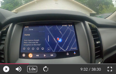
Data from these studies includes surveys, diaries, scripted tasks, and interviews. Automotive studies in particular featured many hours of video capturing naturalistic, in-cabin tasks and driver behavior.
Problem
Researcher users were frustrated; Pulse Labs’ media player was lacking features and they were forced to use external tools to accomplish basic collaboration, note-taking, and insights tracking. It didn’t make sense for a “testing and insights platform” (our main product) to be missing critical features.
The original media player had ordinary playback features—nothing for deeper analysis or collaboration.
How can we design the media player itself to help researchers discover testing insights?
Approach
I met with Google’s Android Auto team to understand their pain points and feature requests, which included:
See where a task starts and ends (including overlapping tasks)
Create highlights (mark interesting parts)
Leave comments
Context really matters to research. Researchers care not only about what pain points users have, but also when and how they happen during tasks. Therefore it made sense to visualize tasks, highlights, and comments where they occurred on the progress bar as opposed to removed from it (maybe this is obvious but that's the rationale).
Exploration & Discovery
Initial concepts
I did research on various media players for inspiration to ensure no useful playback feature was overlooked. Next I made a list of necessary components, sketched some ideas out, and quickly prototyped the most promising one to get a feel for the concept.
Unfortunately the prototype felt cluttered (especially when collapsed) and it lacked hierarchy—I thought differentiating elements with color would help but I wasn't happy with how busy things looked.

Collapsed: Overlapping elements are ambiguous and overwhelming
Expanded: Stacks too high and lacks hierarchy
Challenging assumptions
I went back to the drawing board and sketched out more ideas to prioritize simplicity and reduce cognitive load, and ended up with these rough concepts that were a step in the right direction for clarity:
The default state (mouse leave) simplifies into a very compact state for optimal viewing clarity as opposed to showing every single element.

On hover, tasks are simplified into segments of the progress bar itself. The name of tasks appear below next to the playback time. This drastically reduces visual clutter.
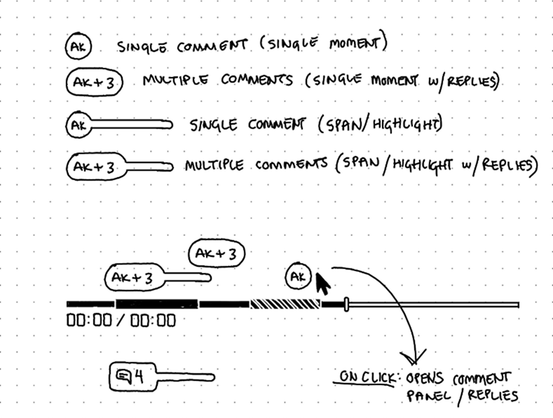
It also occurred to me that highlights as independent elements doesn't make sense; a highlight should never be without a comment to give it meaning. So I reworked comments to absorb the role of highlights. Here's how:
In addition to basic comments that discuss one specific moment in time, comments can also visually span an interesting chunk of time, essentially replacing highlights. This choice simultaneously declutters the UI and promotes discussion.
Solution
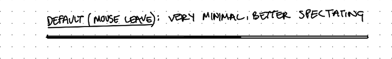
Default states
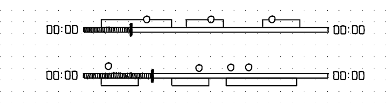
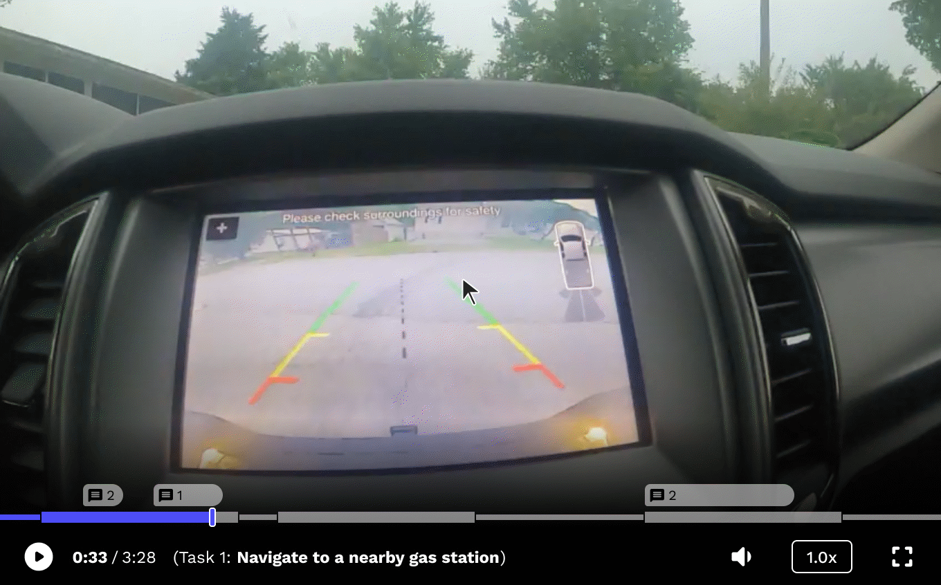
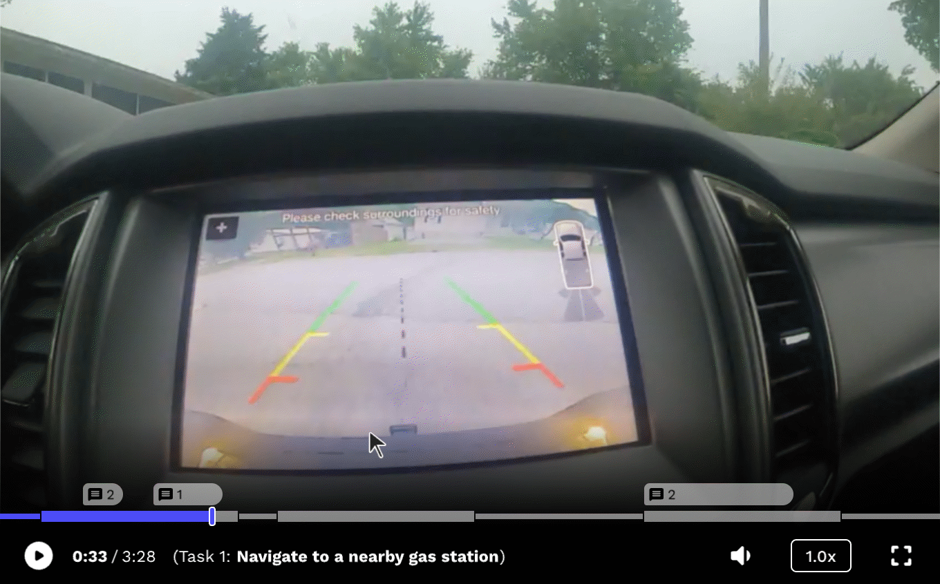
By default, the progress bar collapses to a uniform height for optimal viewing clarity. Comments remain above in a compact form to alert users when playback approaches an interesting point in the media. On hover, the progress bar expands to reveal task locations and comment details.

Default mouse-leave and hover states
Note: The spaces between tasks signifies the time the user is in the Pulse Labs app and away from the tasks or product. This time may vary significantly depending on the user and the type of study, and is shown for demonstration/developer purposes only.
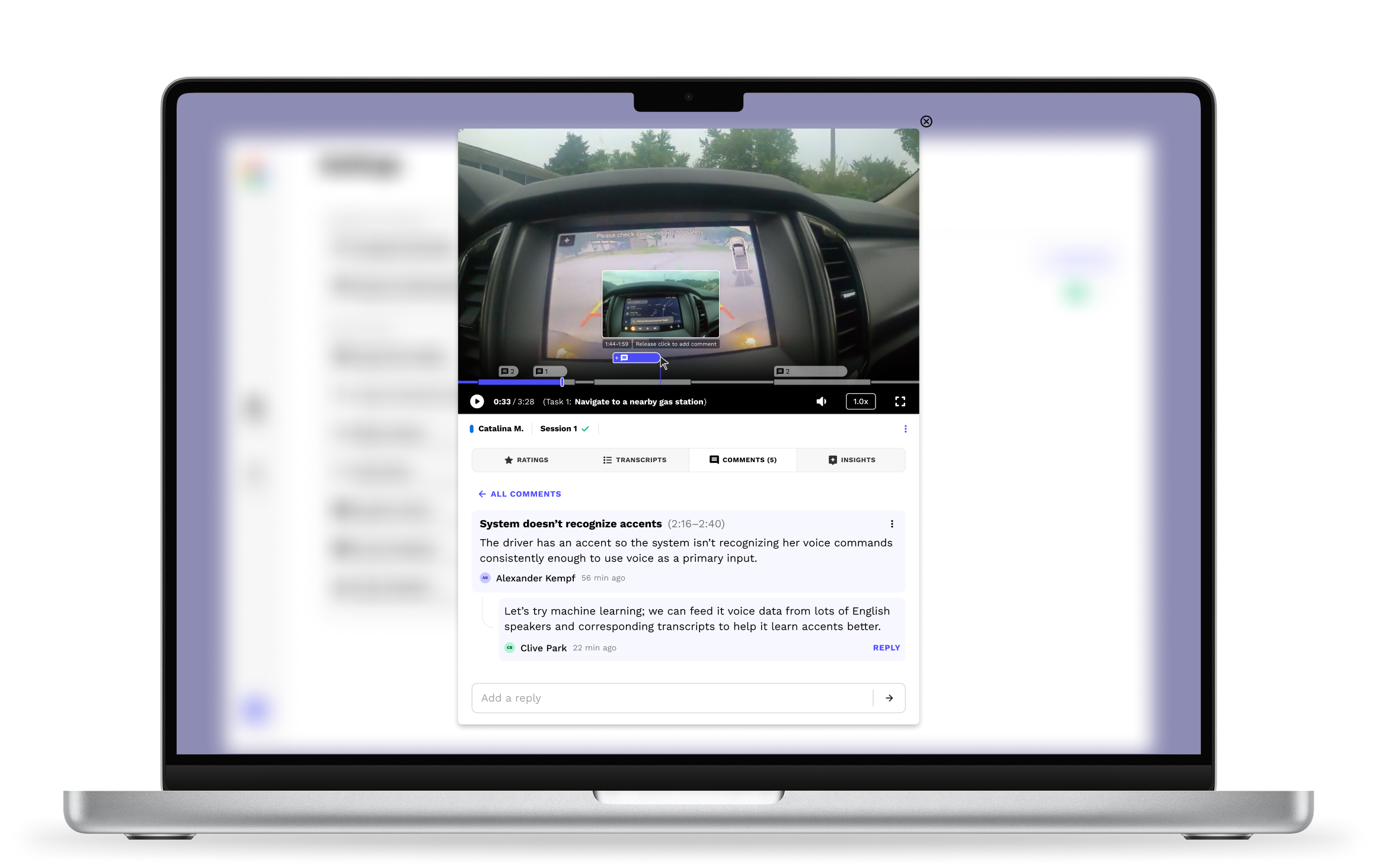
Commenting
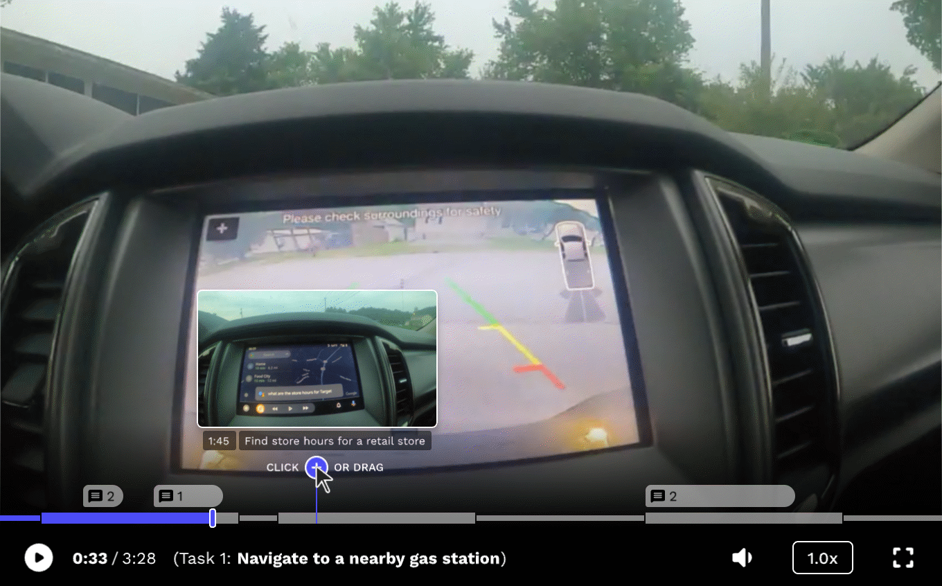
Hovering over the progress bar reveals a scrubber and "add" icon which act as an entry point for adding comments. Hovering over the icon reveals a small tooltip to help users understand how to add different types of comments—click or drag.
Hovering over the "add" icon shows users they can click or drag to add a comment.
Simply clicking the "Add" icon adds a comment at a single point in time on the progress bar.
Adding a comment on a single moment in time.
Clicking and dragging the icon allows users to add a comment that spans a range of time, essentially absorbing the function of highlights.
Adding a comment that spans a range of time.
Viewing & Replying
Hovering over comments displays a short preview for shorthand review but can always be clicked to reveal the full message in the Comments Tab, allowing users to review, edit, or reply to it. The number next to the comment icon denotes the amount of comments in that thread, including the original.

Hovering on a comment displays a preview
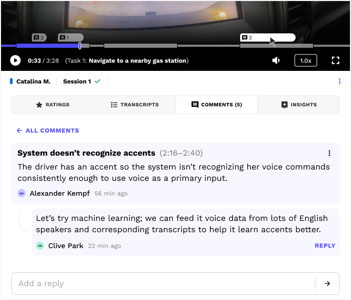
The Comments tab automatically opens when a user clicks on a comment in the progress bar
These features allow teams to markup the video and call out interesting parts, leading to an environment where insights are more likely to be found.
Edge cases
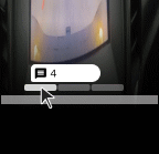
If users add overlapping comments, only one of them is shown at once (default is first chronologically), and the other comments are hidden into tabs underneath—clicking a tab reveals where the comment occurs, and users can cycle through to reveal them individually.
This allows multiple stacked comments to appear without expanding vertically into the media.
Next steps...
Here's what I'd do differently if I had the opportunity, time, and resources:
Add the ability to toggle off the spaces between tasks for a more streamlined task view (less clutter)
Add animated helper icons to assist users with learning how to add spanning comments
Rework how stacked comments are displayed to help users see more of them at once (if desired)
Check in with our clients and conduct usability testing, interviews, and/or surveys
See more work