naturalistic Capture overhaul
How can we help researchers get better study data and improve the participant experience?
(Apr 2026 · 5 minute read)
Summary
Industry
Technology
UX Research
Responsibilities
UI design
User research
Interactive prototyping
Engineering handoff
Timeline
Q1 2024
Redesigned a mobile-first experience for recording naturalistic tasks. It involves a restructured capture methodology, major reduction in tedious participant input, advanced help options, and robust researcher customization to ensure participants experience less friction during a study and researchers get ideal capture data.
Highlight: The foundational task recording methodology was making key UX features impossible, so I approached Engineering to pitch an alternative methodology for capture. It was a challenging redesign for both teams, but it reduced our tech debt and made the product far easier to use and gather better data. An improved UX is always worth the extra effort.
Skip to final design
Context
Pulse Labs’ main SaaS product is a platform that helps researchers draw out product and user insights from naturalistic studies. Companies like Google, Amazon, and Rivian invested millions of dollars on our testing software to strategically guide product development.
A major part of naturalistic studies involves participants recording themselves conducting predetermined tasks. These tasks are tracked and recorded through the Pulse Labs app, and carefully designed by researchers to test usability and draw out product/user insights.
Problem
Initially, the flow for recording tasks was full of obstacles and highly unfriendly to participants, especially:
Copy/paste the tasks to another app for future reference
Don't return to the Pulse Labs app for help until recording is over
Record all tasks consecutively
Go back to manually set the start/end timestamps of each task
The old flow; very text-heavy and lacking help. There's virtually no guidance for users.
The UX was making it easy for participants to make mistakes and become frustrated, which can affect research data.
Approach
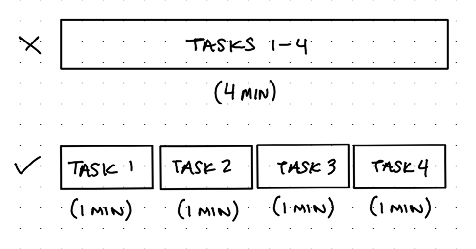
I studied the old flow and realized the main issue is the system records everything as one large media file. I talked to Engineering to hear why and pitched an alternative: Most of the bad UX would be solved if the system recorded every task separately because participants wouldn't need to copy/paste tasks to another app nor would they need to tediously mark task timestamps after recording.
Engineering said it was possible to rework how recording was handled.
There were some other feature requests that made sense to design and ship together:
Researchers had been asking for a way to display modality (which is how users should complete a task, such as "with tap" or "while parked" or "while outdoors") during a task without typing it into the task itself.
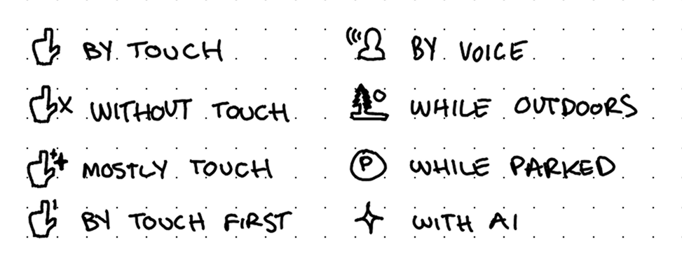
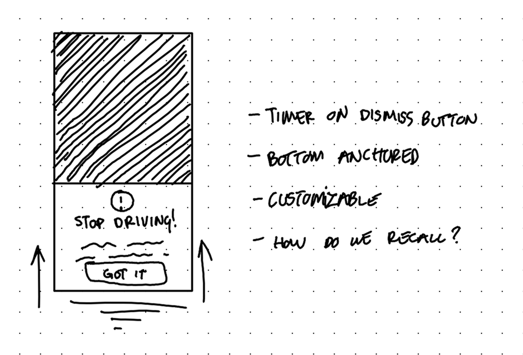
My design lead also requested we add a context prompt feature, which would allow researchers to add detailed context or directions before one or more tasks. After it's dismissed, participants should be able to view it again as a reminder how to do tasks.
Exploration & discovery
In addition to modalities and context prompts, I tried empathizing with/putting myself in the position of our users: "If I was a participant/researcher, what would make recording with Pulse Labs a joy?"
I came up with:
Time and equipment requirements screen before starting
Safety disclaimer/reminder (when applicable)
Recording/camera preview before starting
Customizable researcher tools
Review screen before uploading
All of these concepts respect the participants' time and the effort put forth by the researchers in pursuit of naturalistic data.
At first I thought reviewing tasks immediately after doing them was the best reviewing method. But on-paper, it felt clunky; it forced participants to slow down when their recording is usually fine, and overall slows down momentum.
I felt a lot better about an optional Review screen after all recording has ended, right before uploading. This allows participants to review and restart a task if there's an issue without needing to navigate through tasks mid-session/mid-recording.
Solution
Note: Another designer had recently refreshed the design system assets, so that's why these newer designs look so different from the original.
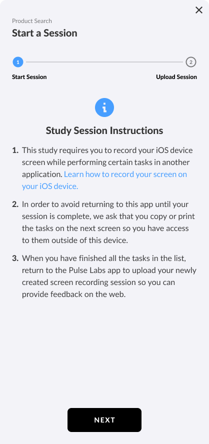
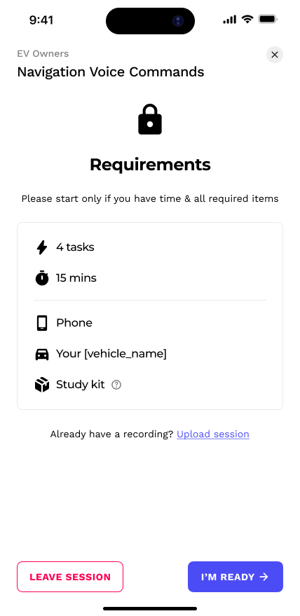
Every recording session leads with a Requirements screen. It helps participants know what to expect and if they're ready or not.
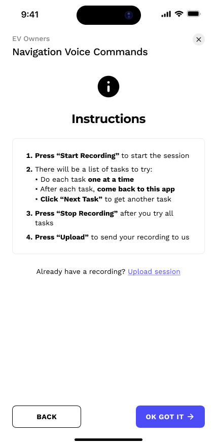
The next screen displays Instructions—notice the lack of an embarrassing "copy/paste" request.
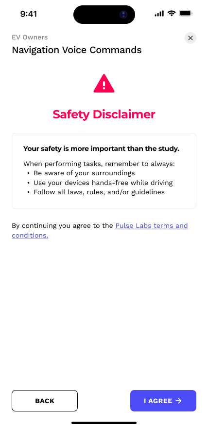
And finally, for obvious reasons, a Safety reminder screen appears whenever automotive sessions occur.
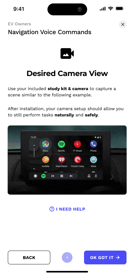
The Camera Preview isn't new, but I added help modals that display how to set up the study kit camera.
Context prompts show up as bottom-anchored modals before tasks. I made the confirmation button on a short 3 second timer. This prevents them from speeding through without reading, but doesn't feel like a long, tedious barrier either. These prompts can always be recalled for future reference.
.gif)
Context Prompts, like "Park your vehicle", help participants understand how to do tasks uniformly
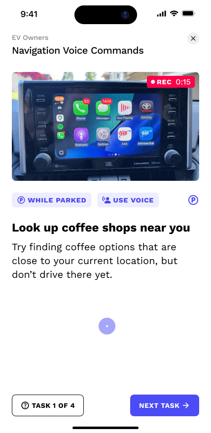
Separating the modality from the task itself creates better hierarchy and contrast. I placed it above the task so that participants read it first and get primed on how to do the task.
.gif)
Beyond the default Context Prompts and Modalities, researchers have rich customization tools to create ones that perfectly fit their research methods.
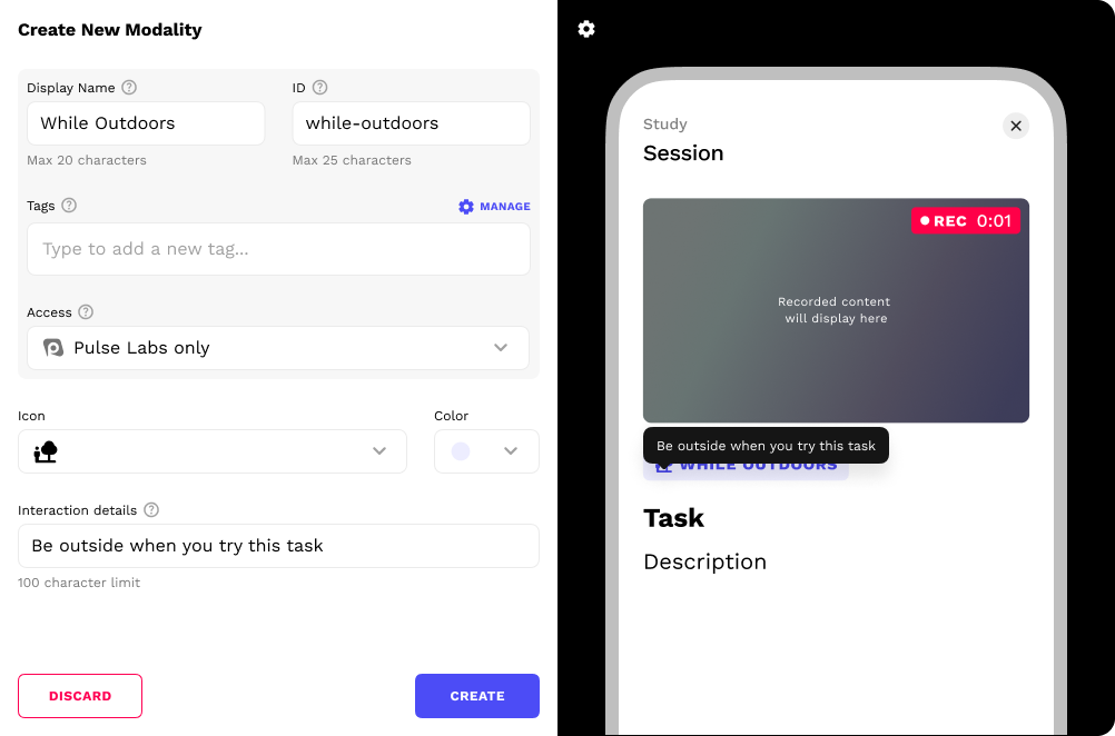
Modality creation tool

Context Prompt creation tool
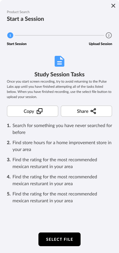
On the bottom left, there is a button that serves as both a task counter and a link to help options in case they have trouble completing it.
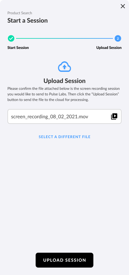
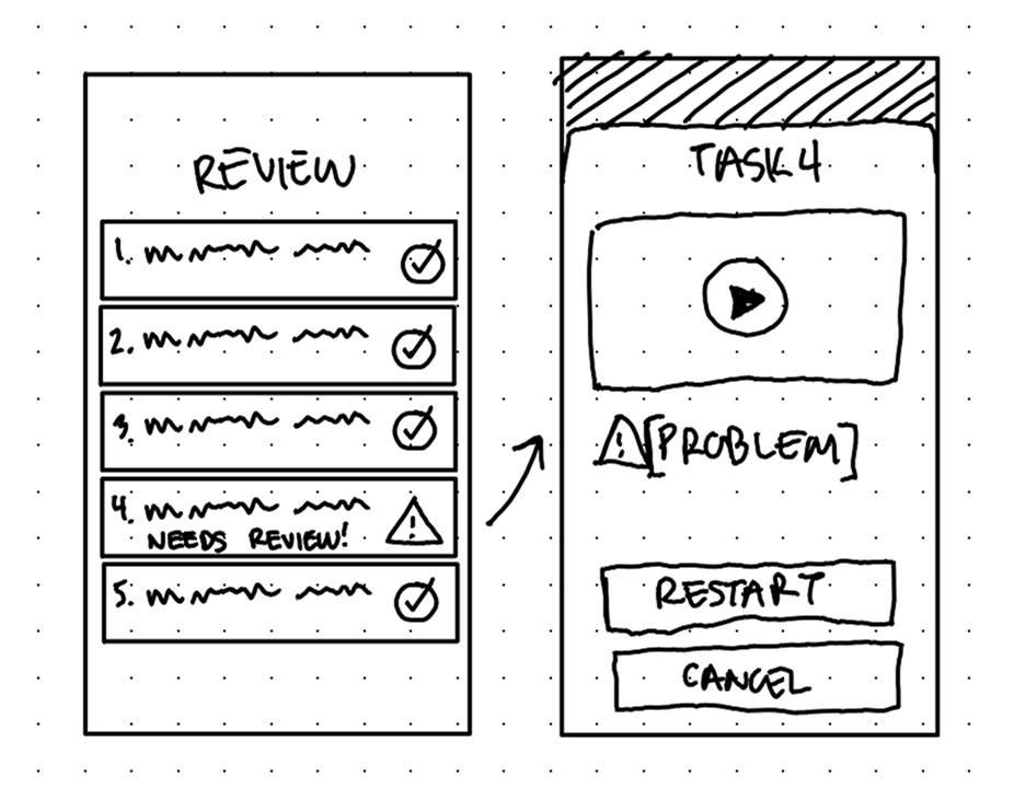
Before uploading, there is a Review screen. Here participants are informed of any issues with their tasks (like recordings that are too short or corrupted). There's a chance to review the recordings and restart if necessary, allowing participants to fix issues without navigating back through tasks and ruining the recording.

After uploading their recordings, participants spend their time rating the tasks instead of tediously marking timestamps of each task.
Impact
The product I worked on at Pulse Labs wasn't consumer technology so many quantitative UX success metrics were not available (however, our software enabled researchers to gather those UX metrics).
The exact effect of our software remains confidential to the clients so my success is evidenced in their continual reliance on the features I designed that help drive million-dollar product decisions.
Product impact: Researcher users can communicate task directions more clearly, leading to better capture data for researchers and less restarts for participants. Overall, everyone wins: participants have a smoother UX and researchers get better capture data, both of which keep them coming back to Pulse Labs.
Our internal team tasked with study support saw fewer rejected recordings due to poor framing or confusion about task directions.
Personal impact: Instead of just overhauling the visuals, this was another opportunity to practice user empathy and fix everything that was wrong with the UX. Communicating with our users, internal researchers, engineers, and my design lead revealed so many great product opportunities and I'm very pleased with how I was able to merge all of them into a flow that serves researchers just as much as participants.
Back to all work
© 2026 Alexander Kempf
(Call me Alex)