Neonatal Glucose Workflow
How can we prevent life-threatening mistakes on a neonatal nursing floor?
(Feb 2026 · 5 minute read)
Summary
Industry
Healthcare
Responsibilities
Research
UI design
Validation
Timeline
Q1 2023
Redesigned a highly confusing (and erroneous) medical document for neonatal nurses to help them better care for their infant patients. The redesign instantly helped nurses avoid lethal policy errors for their high-risk patients.
Skip to Impact
Context
UCI Medical Center in Orange, CA has a high-risk labor and delivery floor designed to care for mothers and babies with rare or difficult pregnancy/birthing complications. They approached me to help them redesign their hypoglycemia (low blood glucose) screening workflow. This workflow is essentially a shorthand reference to their longer nursing policy on testing infants' blood glucose.
Note: While this wasn't "product" design, it was certainly experience design; nurses reference this workflow sheet to inform them on next steps for critical, dynamic infant care.
Problem(s)
The current workflow sheet was confusing and causing nurses to make mistakes with their patients:
Unclear when to involve a doctor/NICU
Steps unclear if test results are 35 on the second test
Nurses unaware of success criteria
Arrows prevent repeating steps and causes confusion/dead-ends
Appearance is overwhelming, inconsistent, and lacking hierarchy
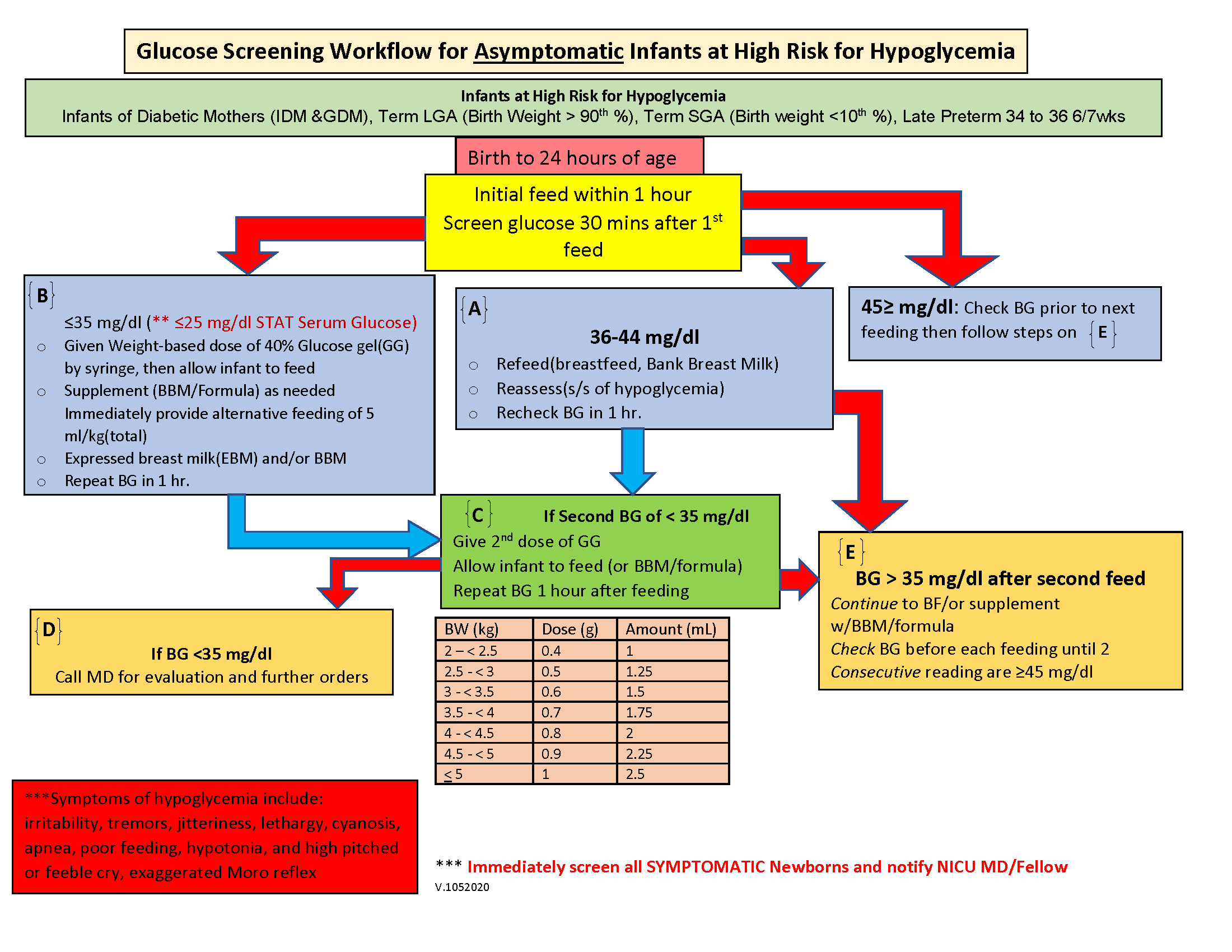
The original version. No wonder the nurses were getting confused.
Approach
I studied the current workflow and the full policy, asking a lot of questions along the way (especially about terminology and abbreviations). Eventually I understood the process, and it's a lot more simple than I originally thought.
In essence, the workflow is a list of if-then statements: "If blood glucose is X, then do Y". Understanding this gave me a framework to begin visualizing the steps in a way that was intuitive and less prone to error.
As far as visuals, I really wanted to make the arrows work; they help the eye flow naturally from step to step. But when repeating a step or jumping to another step, the arrows become cluttered and it feels overwhelming.
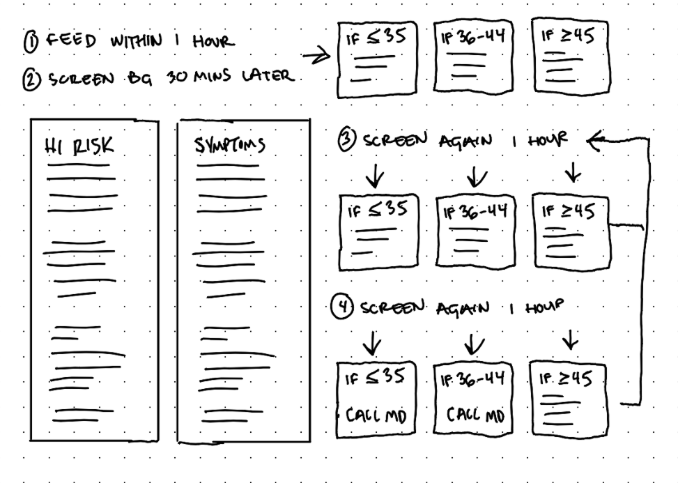
Too many arrows and it's still possible to get stuck or loop endlessly.
Trying to reduce the tangle of arrows by omitting some arrows just commits the same mistake as the original version: Nurses can get stuck in a dead-end when the policy actually requires continued steps.
Early draft. It was more organized, but consecutive loops were unclear.
So the arrows had to go, and something more flexible and structured had to replace them. I saw some potential in the concept behind those old "choose your own adventure" books where, when met with a fork in the story, the reader would turn to a specific page and continue their story from there.
The original version had about 6 boxes with directions (A, B, C, D, E, F). This was excessive when the steps truly come down to some combination of just 3 steps:
if BG is less than or equal to 35, then do X
if BG is 36-44, then do Y
if BG is greater than or equal to 45, then do Z
This general framework lets nurses loop and skip around as necessary.
Solution
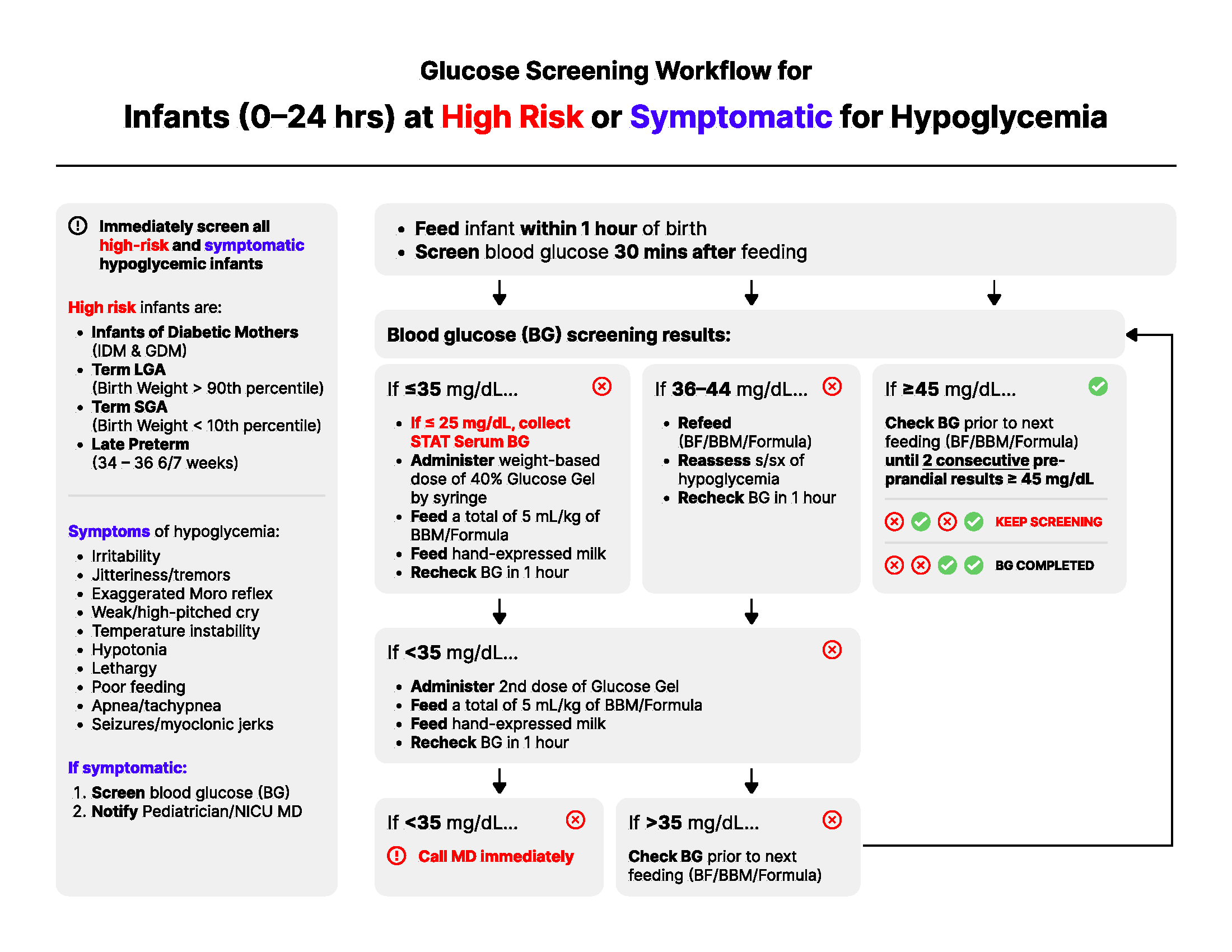
I led the workflow with fundamental information like symptoms and high risk factors. Afterall, this workflow is for asymptomatic infants, so if a symptom is identified, the nurse can immediately skip the majority of these steps.
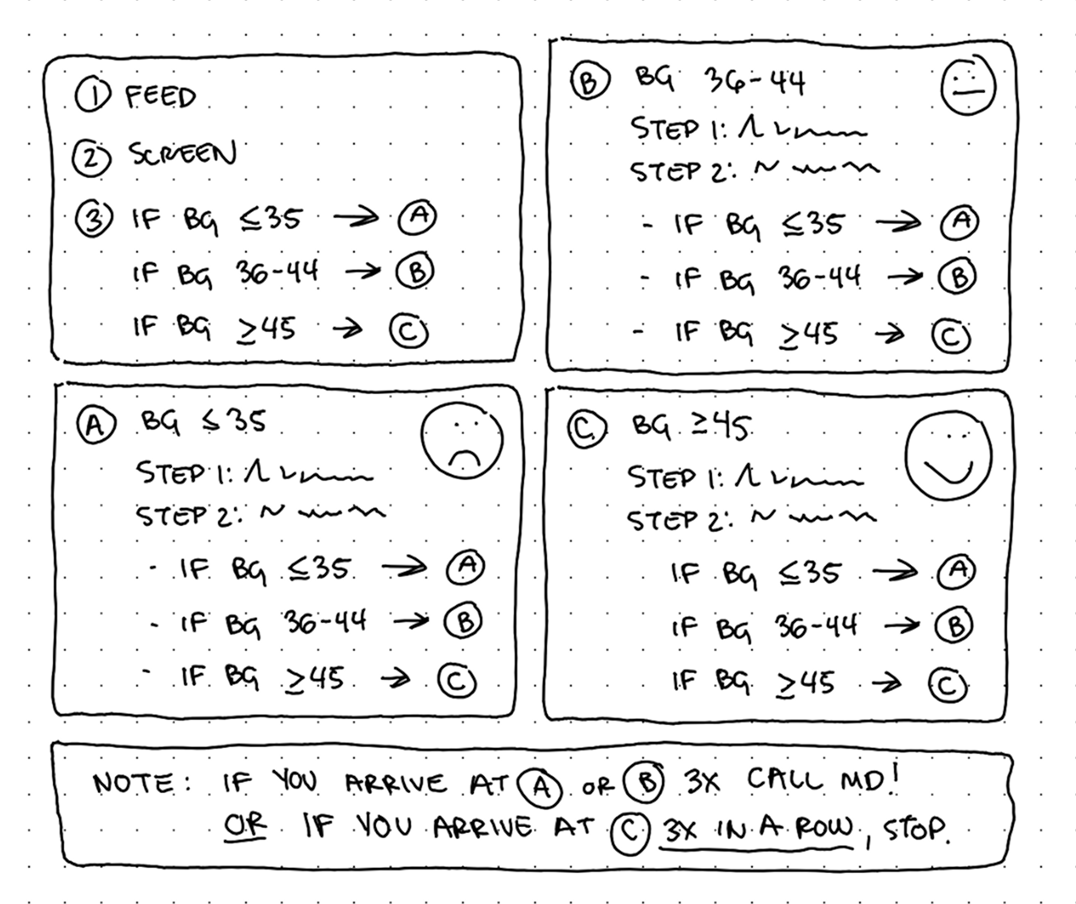
If the infant is asymptomatic, the nurse starts at Steps 1-3, which are completed once. After, a nurse reaches Step A, B, or C and they simply follow the appropriate steps, which leads them back again to either Step A, B, or C. This continues until they reach:
Step A three times (very bad, contact a doctor)
Step B three times (not good, contact a doctor)
Step C three times consecutively (ideal, stop screening BG)
It's that simple!
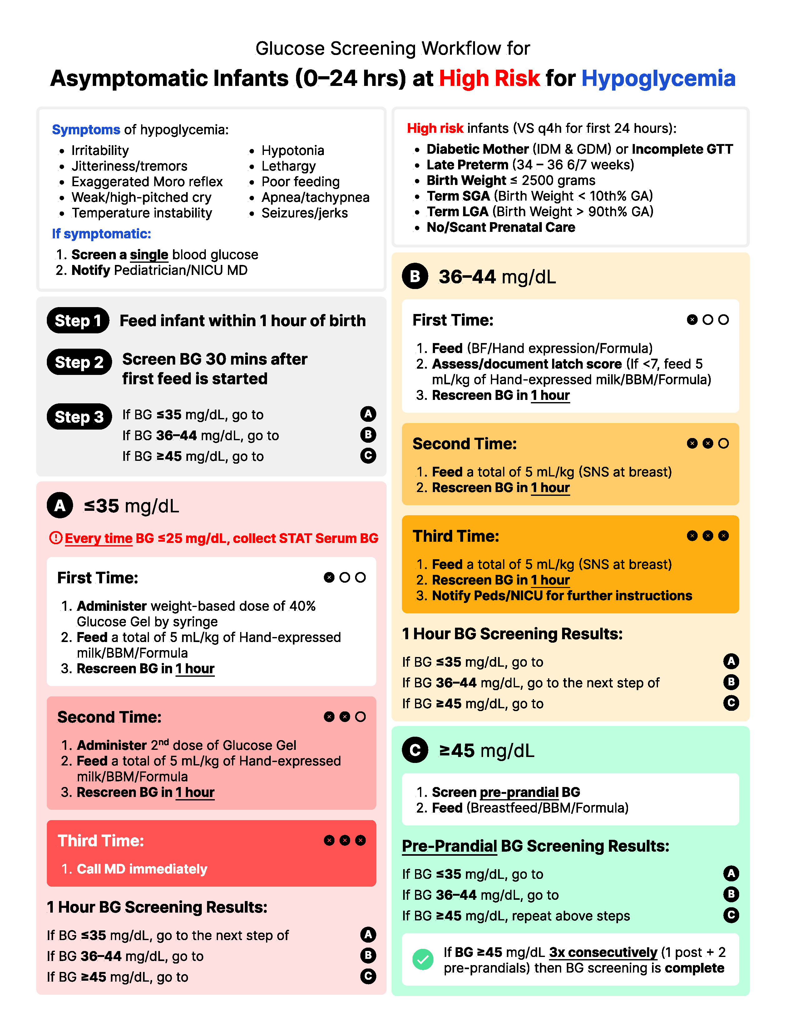
The steps themselves are high contrast and bold which establish clear waypoint hierarchy. I used bold text within the directions to highlight the most important aspects at a glance.
The colors in Steps A, B, and C reflect the severity of the test results:
Step A is red (very low blood glucose)
Step B is yellow (low blood glucose)
Step C is green (normal blood glucose)
Within Steps A and B, the saturation increases every time a nurse revisits the step, visually communicating the building severity of the test results until they hit 3 strikes (represented in each box by black circles and X's) and to contact a doctor for help.
Impact
Beyond a few wording changes, the new design was an instant hit with the unit. It's printed and posted everywhere (some even said it's pretty to look at).
New and old nurses were delighted to have a workflow that was more intuitive, more informative, and impossible to hit a dead-end with. The unit reported a sharp falloff in policy deviations and confusion. It's awesome knowing that at-risk mothers and babies are receiving better, more consistent care as a result of the redesign.
The project was also a reminder that UX design isn't just in software, it's everywhere.
Back to all work
© 2026 Alexander Kempf
(Call me Alex)